Why Weird Keycaps Work: Turning Familiar Ideas Into 3D Objects
What a hot dog, a Shiba warrior and a capybara can teach brands about creating custom 3D keycaps that people recognise, use and remember.
The Keycap Was Not the Starting Point
The first idea was a hot dog.
Not a hot dog printed on top of a keycap. The bun, sausage, ketchup and mustard would become the keycap itself.
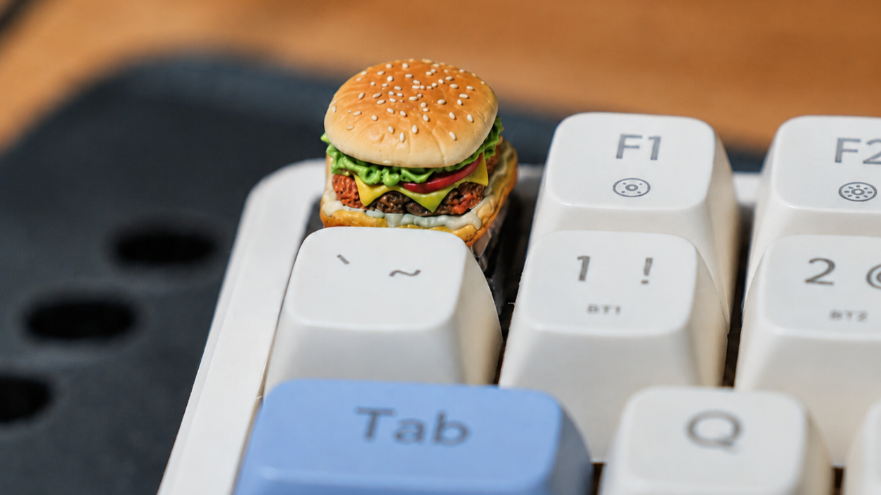
It sounded slightly ridiculous, which made it interesting. Once the first version worked, the question changed. We were no longer asking whether a hot dog could belong on a keyboard. We were asking what else could become a working key.
A burger followed. Then came characters, mascots and miniature scenes. Some were immediately recognisable. Others needed to be simplified before they made sense at keyboard scale.
That process taught us something useful: making an unusual keycap is not about adding as much detail as possible. It is about finding the few details that make an idea unmistakable, then preserving them in an object that still works.
The Keycap Was Not the Starting Point
Most customisation begins with an existing product.
Here is a blank keycap. What should we print on it?
That is a practical place to begin, but it also lets the existing product decide how ambitious the idea can be. The artwork has to fit the available surface, so the keycap remains the product and the idea becomes decoration.
The hot dog reversed that process. We started with the object and asked what the keycap needed to become.
That shift sounds small, but it changes the entire design conversation. Instead of asking where the logo should sit, we can begin with a mascot, signature product, community reference or inside joke. The shape, colour and physical character of the key can then develop around that idea.
Food and keyboard culture may sound like an unlikely pairing, but other brands have found the same intersection. In 2025, KFC China and ASUS ROG paired a burger campaign with limited edition keycaps. The useful lesson is not that every brand should put dinner on a keyboard. It is that a small keyboard object can connect two interests in a way that ordinary merchandise may not.
Beginning with the idea creates more possibilities. It also creates the next design problem: the idea still has to remain recognisable after it has been reduced to the size of a key.
Recognition Has to Survive the Shrink
A character shown at full size may have dozens of features, textures and accessories. A sculpted keycap has very little space, and every extra detail competes for attention. Trying to preserve everything can make the final design harder to understand.
The better question is: which details carry the identity?
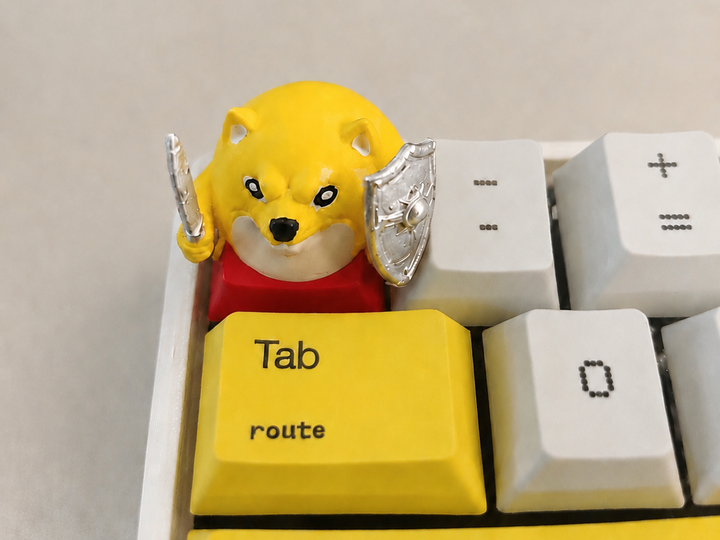
For the Shiba warrior, the ears establish the character, while the sword, shield and bold colour blocks establish its personality. Remove every decorative detail and those elements still need to survive.
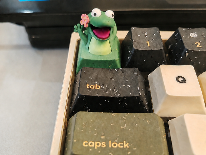
The same principle applies to the frog. Its large eyes, open smile and tiny flower do more work than a collection of smaller textures ever could. The capybara needs its rounded face, bath and bubbles. Without the bath, it becomes an ordinary animal figure. With it, the entire miniature story becomes clear.
A strong design usually protects three things:
- A recognisable silhouette
- Two or three defining visual cues
- One detail that gives the idea personality
This does not mean the result has to be visually simple. It means the complexity needs a hierarchy. The viewer should understand the main idea first and discover the smaller details afterwards.
Once those cues remain clear at miniature scale, the shape can begin doing more than representing a character. It can also carry the identity of a brand or community.
When the Shape Becomes the Brand
A logo is one way to identify a brand, but it is not the only one.
Mascots, colours, characters, symbols and product shapes can also become distinctive brand assets. The Ehrenberg-Bass Institute notes that these assets support quick recognition when they are strongly and uniquely connected to the brand over time.
That distinction matters. A random character does not automatically become a brand asset simply because it appears on merchandise. The connection needs to be specific enough that the intended audience recognises it and consistent enough that they continue making the association.
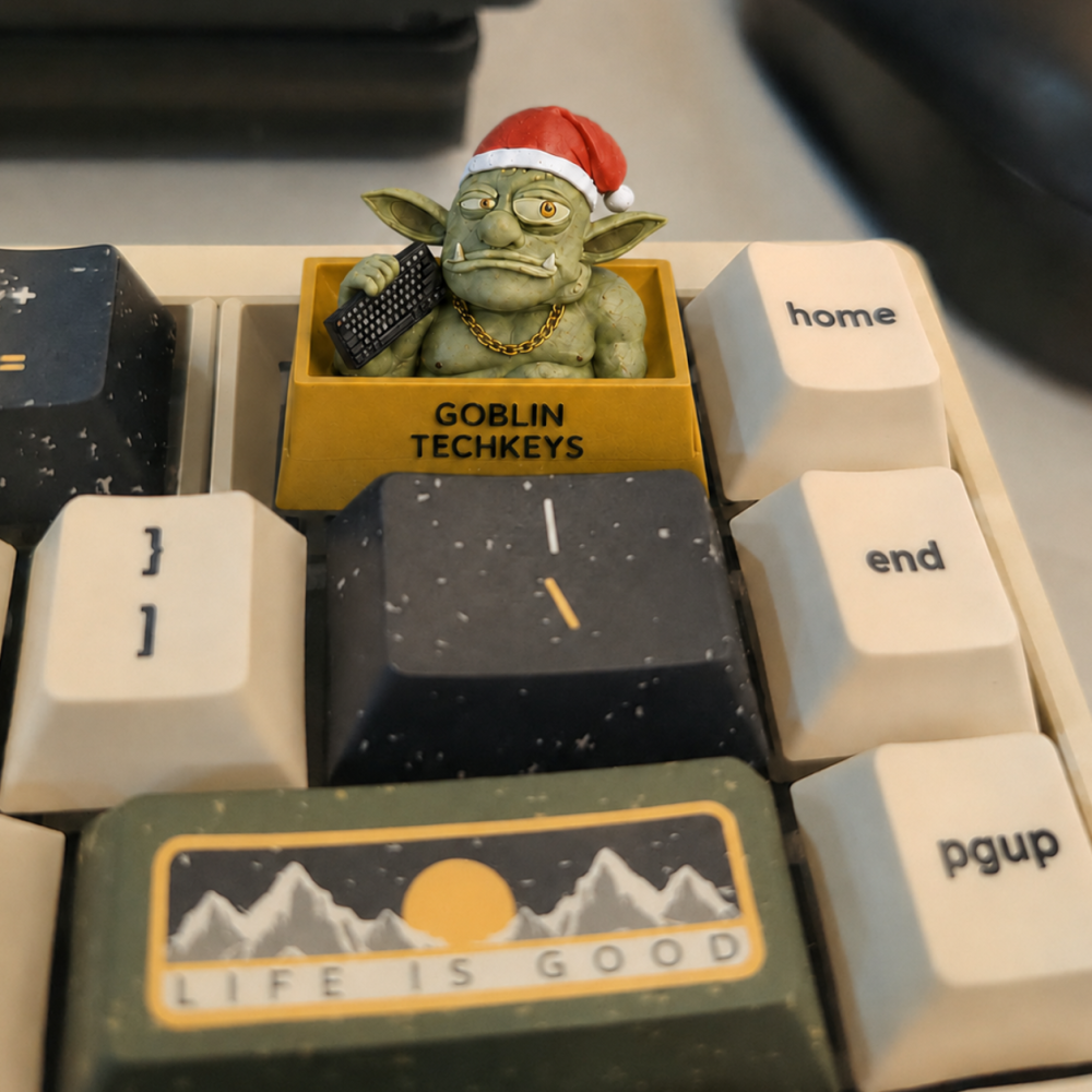
Our Goblin character illustrates the opportunity. Its green skin, pointed ears, expression and personality can make an object feel recognisably GoblinTechKeys before someone stops to read the name on the base.
Razer recently took a related approach with its first artisan keycap. Instead of printing its triple headed snake emblem onto a standard cap, the company turned the emblem into a sculpted three dimensional object and presented it as a limited collector’s piece for its community.
The shape did not merely contain the brand. The shape was the brand.
Recognition alone, however, does not guarantee that someone will care. The idea still needs enough personality to deserve a second look.
Strange Only Works When It Is Specific
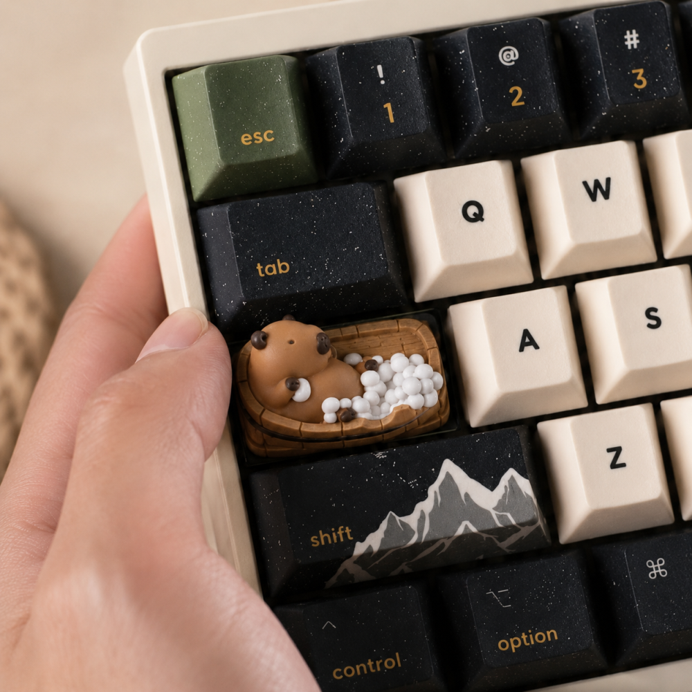
A capybara sitting in a bathtub is strange enough to interrupt the visual rhythm of a keyboard. It makes people pause because it appears where nobody expects to find it.
But its strength does not come from randomness alone. It works because the scene is specific and easy to understand. The capybara is relaxed. The bubbles establish the bath. The contrast between an ordinary keyboard and a tiny domestic scene creates the surprise.
That is the difference between an unusual design and a confusing one.
A memorable keycap should give the right audience a quick point of connection. It might be a mascot they already know, a food associated with the company, a joke shared by the team or an object connected to the work they do.
The idea does not have to appeal to everyone. In fact, trying to make it universally understandable may remove the detail that makes it special. What matters is whether the intended recipient sees it and thinks, “This was made for people like us.”
That moment creates curiosity and conversation. Still, earning attention is only half the job. A keycap also has to survive life as a physical control.
From Conversation Piece to Working Key
A sculpture can succeed by looking good from one angle. A sculpted keycap has more responsibilities.
It needs to fit its intended switch, leave suitable clearance around neighbouring keys and provide a stable place to press. Its most recognisable features should remain visible from the angle at which someone normally views a keyboard. Tall accessories, narrow points and delicate protrusions also need to be considered in relation to everyday handling.
These practical constraints influence where a design belongs. A highly sculpted character may work better on an Escape key or another less frequently pressed position than in the centre of the main typing area. A lower and broader design may be suitable for more regular interaction.
This is why prototyping matters. A concept can look convincing as a render and still feel awkward once placed beside real keycaps. The physical version reveals whether the scale, height, balance and surrounding space actually work.
The aim is not to remove every unusual feature. It is to make sure the unusual feature does not prevent the object from doing its job.
Together, the hot dog, Shiba, frog and capybara reveal the same process: begin with meaning, protect the recognisable details and then make the form earn its place on the keyboard.
Four Questions Before You Turn an Idea Into a Keycap
Before developing a sculpted keycap, bring the idea back to four questions:
- Who should recognise it? Be specific about the community, customer, employee or fan receiving it.
- Which details make it unmistakable? Identify the silhouette, colours and two or three features that cannot be lost.
- Can it still function comfortably as a key? Consider its position, height, surrounding clearance and frequency of use.
- Why does this idea belong to this audience? A meaningful connection is more valuable than strangeness for its own sake.
These questions are useful whether the starting point is a company mascot, a signature product or an idea someone sketched during a meeting. They connect the playful concept to the design and production decisions that make it workable.
The Hot Dog Was Only the Beginning
The hot dog did not become a formula. It became permission to start somewhere unexpected.
Since then, a burger, a Shiba warrior, a smiling frog, a bathing capybara and a Goblin have all found their way onto keyboards. They look completely different, but each one began with the same question:
What makes this idea recognisable before anyone explains it?
That question is more useful than asking what normally belongs on a keyboard. It leaves room for products, characters and stories that were never designed to become keys, but might feel perfectly at home once they do.
The limit is probably not whether an idea seems too strange. The real limit is whether we can make it clear, functional and meaningful at miniature scale.
Bring Us the Idea That Should Not Fit
Have a mascot, product, character or inside joke that would make someone stop and look twice?
Send us the rough sketch, strange reference or half finished thought. GoblinTechKeys can help translate it into a custom 3D keycap designed around your audience, brand and keyboard.

Mission statement isn't a static asset you design once and forget. It is a live promise. In a fast-paced market where users have endless alternatives at their fingertips, authenticity isn't a design aesthetic—it’s the ultimate competitive advantage.
Mission statement isn't a static asset you design once and forget. It is a live promise. In a fast-paced market where users have endless alternatives at their fingertips, authenticity isn't a design aesthetic—it’s the ultimate competitive advantage.
Mission statement isn't a static asset you design once and forget. It is a live promise. In a fast-paced market where users have endless alternatives at their fingertips, authenticity isn't a design aesthetic—it’s the ultimate competitive advantage.
Heading 1
Heading 2
Heading 3
Heading 4
Heading 5
Heading 6
Lorem ipsum dolor sit amet, consectetur adipiscing elit, sed do eiusmod tempor incididunt ut labore et dolore magna aliqua. Ut enim ad minim veniam, quis nostrud exercitation ullamco laboris nisi ut aliquip ex ea commodo consequat. Duis aute irure dolor in reprehenderit in voluptate velit esse cillum dolore eu fugiat nulla pariatur.
Block quote
Ordered list
- Item 1
- Item 2
- Item 3
Unordered list
- Item A
- Item B
- Item C
Bold text
Emphasis
Superscript
Subscript
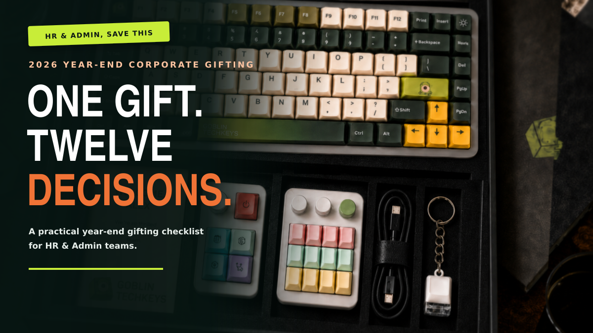
One Gift, Twelve Decisions: The 2026 Year End Corporate Gifting Checklist