
Giving a Brand a Place on the Desk: The Mercury Macropad Project
A look behind the Mercury Command macropad project, where a sculpted metal keycap, a practical shortcut and thoughtful packaging came together.
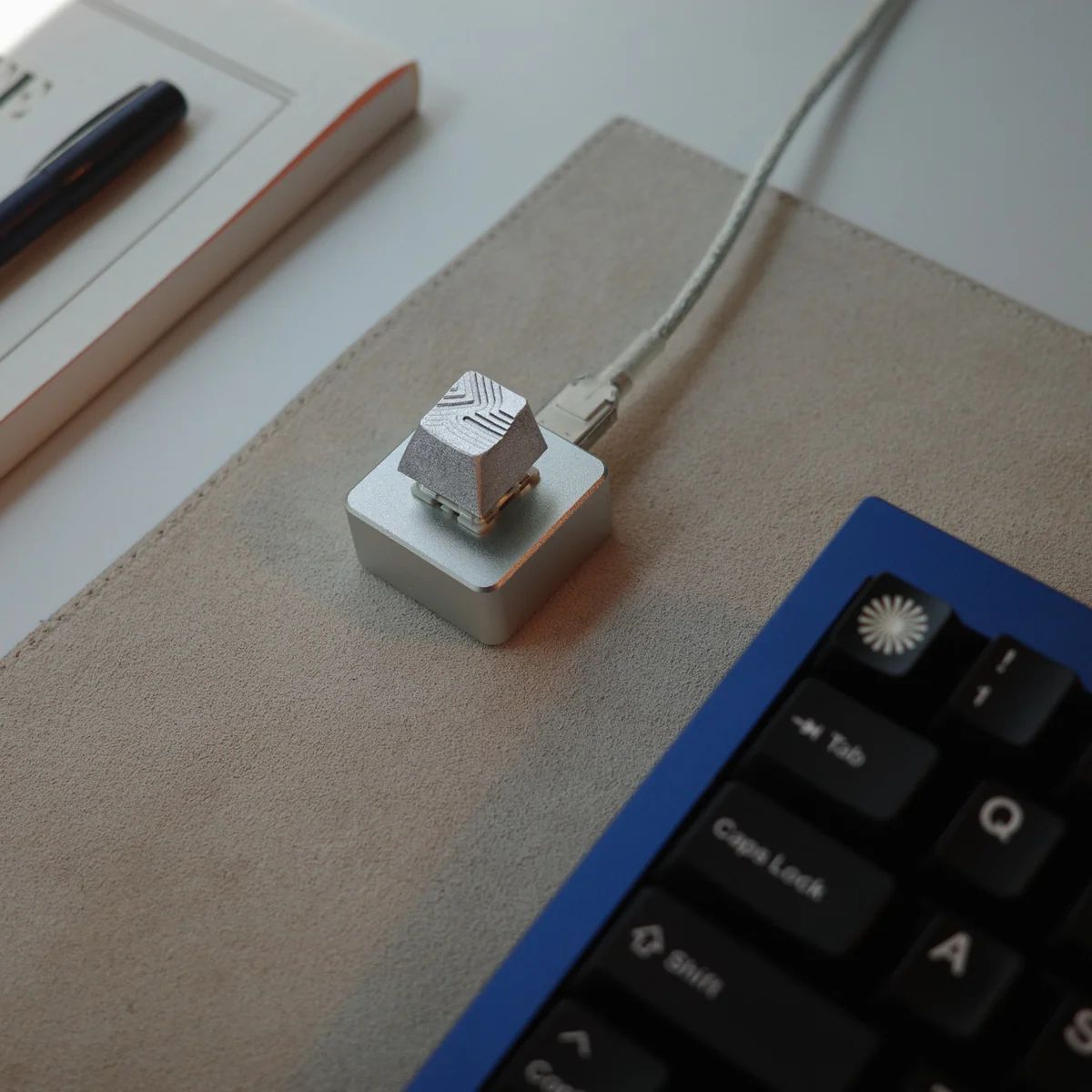

One of my favourite details about the Mercury macropad is that its purpose is easy to explain: press the key to open Mercury Command.
It’s a small interaction, but it gives the object a clear reason to sit beside someone’s keyboard.
At Goblintechkeys, we had the opportunity to contribute to this project for the launch of Mercury Command, Mercury’s AI tool for completing financial work. The finished product brought together a sculpted metal keycap, a metal macropad base and packaging connected to the launch.
Jonathan Simcoe, Product Designer at Mercury, shared the story behind it in his article, “Designing the Mercury macropad”. Reading his account made me appreciate how many people and decisions came together around this one button.
A physical shortcut to a digital product
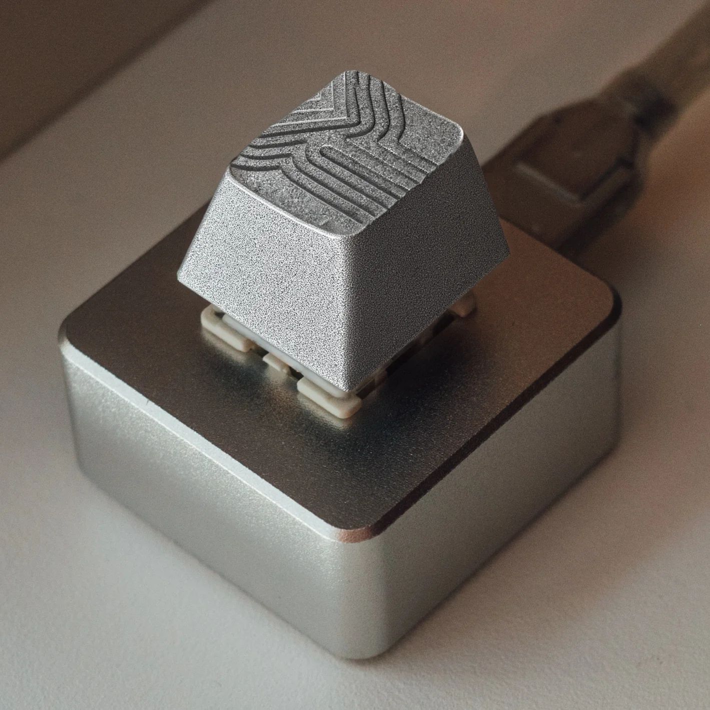
The idea started with a connection to the product itself. Mercury wanted a custom macropad that could invoke Command using its ⌘ + / keyboard shortcut.
That gave the project a useful starting point. Rather than beginning with where to put a logo, the team could begin with an action: what should this object help someone do?
The answer was specific. A single press would provide a physical shortcut to a digital tool.
This is one of the things I find interesting about functional corporate swag. When an object connects to something the company actually helps people do, the branding has more meaning. It becomes part of the experience of using the product.
A collaboration with distinct contributions
The finished macropad reflects the work of several collaborators, each contributing a different part of the experience.
Jonathan worked with Mercury brand designer Kate Apostolou on the campaign’s art direction. Tim Van Damme of MVKB developed the keycap design, exploring how the Command glyph could become a sculpted metal object. Pieter-Jan, known as Salvun, then machined and finished the keycap.
Our involvement came through an introduction from Ben Lang at Cursor, after Jonathan asked him about their Cursor Tab macropad project.
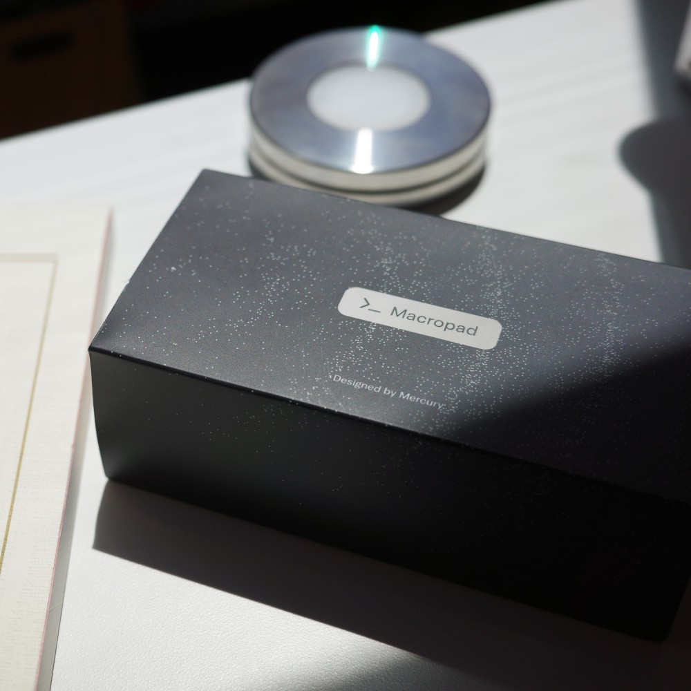
Goblintechkeys supplied the metal macropad base with a mechanical switch, programmed at the factory with Mercury’s ⌘ + / shortcut. We also included a packaging sleeve design that echoed the Command launch graphics.
It was a tight timeline, and our role was to help bring the functional base and packaging together around the artisan keycap.
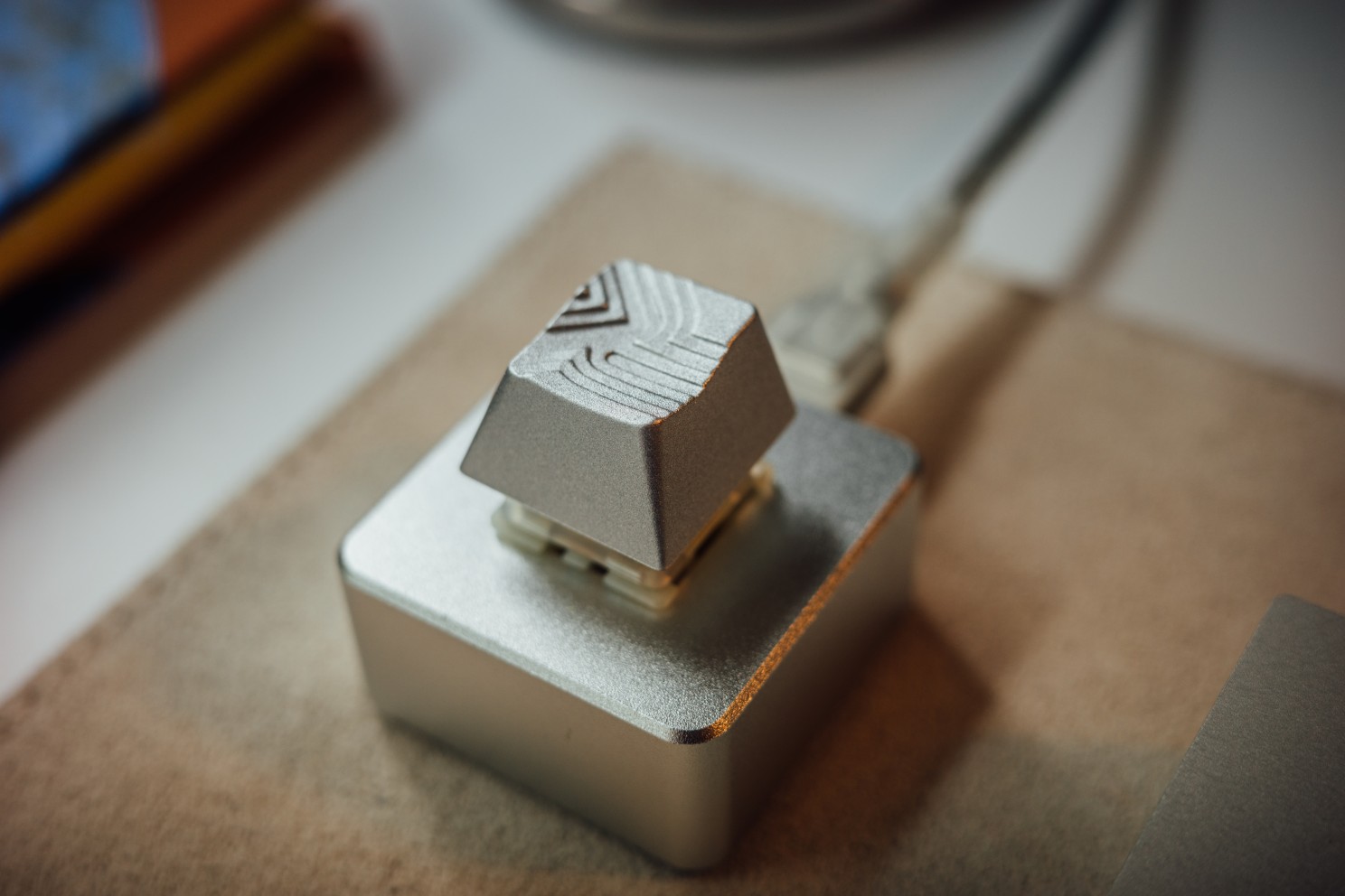
Seeing those pieces assembled into the finished product was especially rewarding. The keycap, base and sleeve each had their own requirements, but they needed to feel like parts of the same idea.
Why the materials and packaging matter
With a small product, people notice the details.
The metal construction, the grooves in the keycap and the feel of the mechanical switch all contribute to the experience. These are things someone encounters every time they reach for the button.
In his article, Jonathan explains that durability was part of Mercury’s intention: the macropad should reflect the qualities they want people to associate with their financial tools.
I like that connection. Material and design choices can communicate something about a company before anyone reads a description.
The packaging carries that thinking into the first impression. Once the macropad is unpacked, the shortcut gives it a practical role on the desk.
What this project reminded me about corporate swag
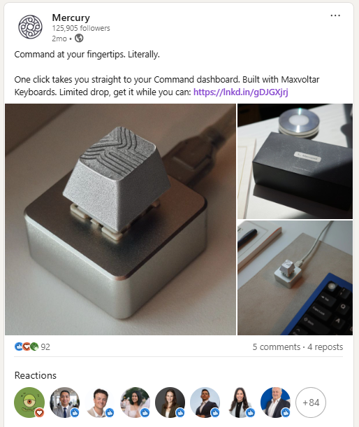
Jonathan shared that the drop sold out in minutes. That was exciting to hear, although it doesn’t tell us how often each person will use theirs.
What stays with me is the thinking behind the project.
For anyone planning branded merchandise, there are three useful questions to take from it:
- What will someone use it for? Start with a clear action or purpose.
- How does it connect to the brand? Consider the product experience, materials and design alongside the logo.
- How do the parts work together? The object, its function and its packaging should support the same idea.
For the Mercury macropad, that connection was straightforward: a physical Command key that opens Mercury Command.
A single key is a small product. But when its purpose is clear, it can earn a place in someone’s workspace.
The people behind the project
Thank you to Jonathan and the Mercury team for involving Goblintechkeys, to Ben Lang for the introduction, and to MVKB and Salvun for the design and craftsmanship behind the keycap.
For a closer look at the design and manufacturing process, read Jonathan’s article, “Designing the Mercury macropad”.
You can also explore the finished piece on the Mercury product page.

Mission statement isn't a static asset you design once and forget. It is a live promise. In a fast-paced market where users have endless alternatives at their fingertips, authenticity isn't a design aesthetic—it’s the ultimate competitive advantage.
Mission statement isn't a static asset you design once and forget. It is a live promise. In a fast-paced market where users have endless alternatives at their fingertips, authenticity isn't a design aesthetic—it’s the ultimate competitive advantage.
Mission statement isn't a static asset you design once and forget. It is a live promise. In a fast-paced market where users have endless alternatives at their fingertips, authenticity isn't a design aesthetic—it’s the ultimate competitive advantage.