
What Makes a School Giveaway Worth Keeping?
A practical guide to choosing school merchandise that reflects a real school moment, carries recognisable identity and has somewhere to go after the event.
The Real Test Begins After the Handout
A school giveaway can be easy to order, easy to distribute and still have no clear purpose once students leave the event. The real test begins when the item has to find a place in a backpack, on a desk or among the things a student chooses to carry.
Research from PPAI offers a useful starting point, although it surveyed recipients of promotional products generally rather than students specifically. Usefulness was the most common reason people gave for keeping an item, while reminders of an event, enjoyment and design also mattered. The finding does not tell schools exactly which product to choose. It suggests that a giveaway needs to earn its place through function, meaning or experience.
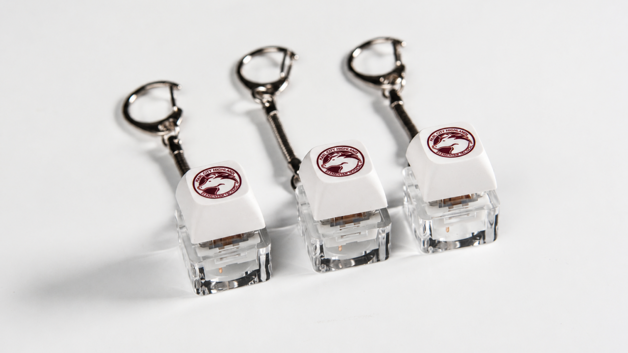
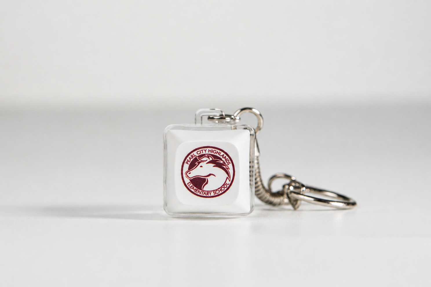
The tactile keycap fidget created for Pearl City Highlands Elementary School provides one way to examine those decisions. Its school mascot establishes the identity, the switch creates a physical interaction and the keyring gives the item somewhere to go after it is handed out. None of those features proves that every student will want one, but together they create a more considered starting point than selecting an item from a catalogue and adding a logo afterwards.
That shifts the first question away from “What should we order?” and towards the moment the item is meant to represent.
Start With the School Moment, Not the Merchandise
A welcome day giveaway and a graduation keepsake do not need to communicate the same thing. Neither should an attendance recognition item, club gift or school fundraiser product.
Before choosing the object, define why students are receiving it. A graduation piece may need to carry the year. A house or club item may need its own colour. A welcome gift may work better with the school mascot because that symbol can remain relevant throughout the student’s time at the school.
Recognition items can mark an achievement, but schools should be cautious about treating merchandise as a proven way to cause better attendance, behaviour or academic performance. An Education Endowment Foundation trial of financial and event incentives found no significant overall improvement in GCSE attainment. A giveaway can acknowledge something a student has done without being presented as the reason they will do it.
For the Pearl City Highlands project, the mascot gives the product a clearly defined school identity without tying it to only one subject or activity. The same format could therefore support different school moments, provided the message, packaging and distribution plan are adapted to the occasion.
Once the moment is clear, the next decision is which part of the school identity students are most likely to recognise.
Use Identity That Already Means Something
Schools usually have several possible identity elements: an official crest, mascot, colour palette, house system, year group and individual club or team graphics. Trying to place all of them on one small product can make the result feel more like an advertisement than something designed for students.
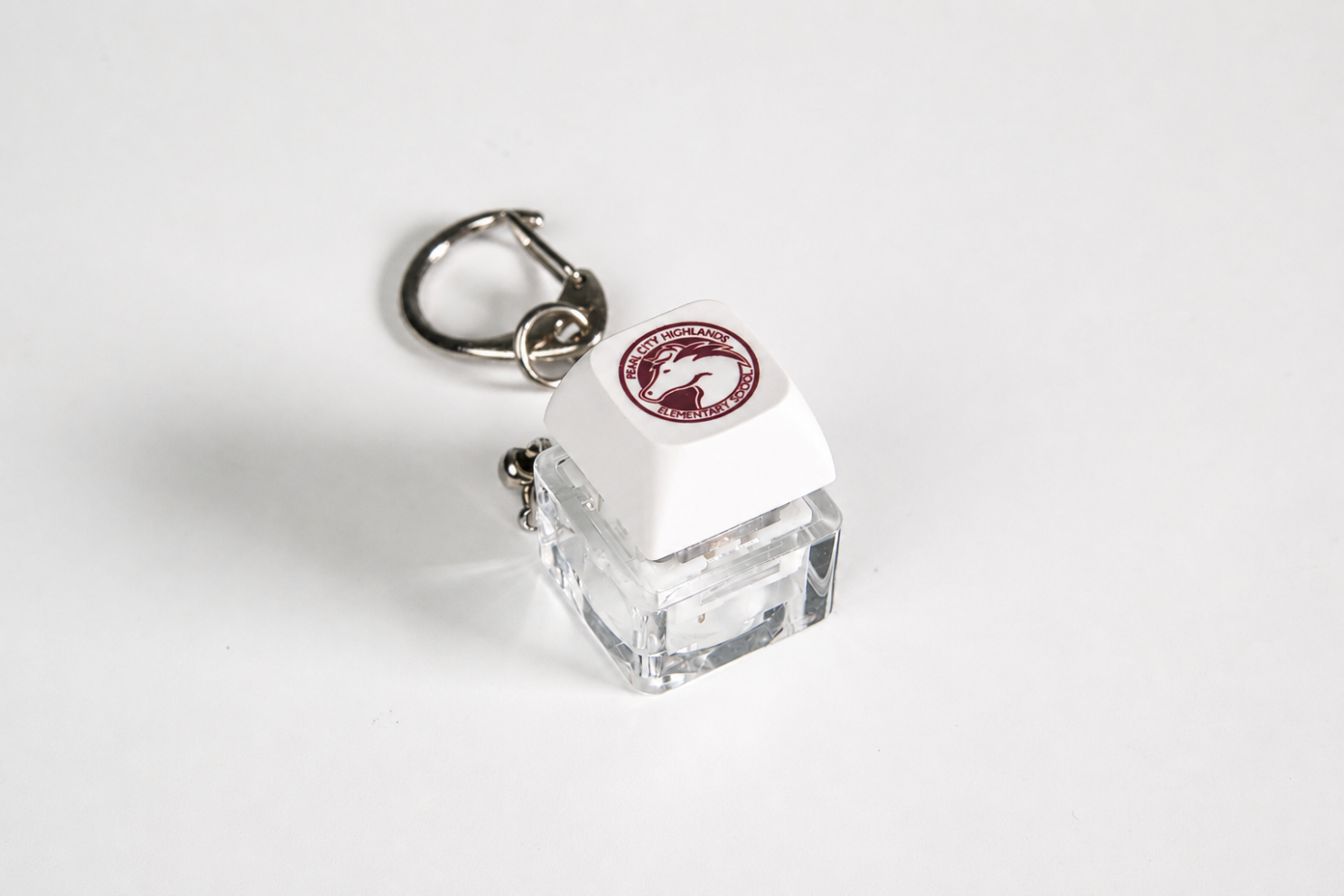
The Pearl City Highlands fidget uses one main symbol. Its horse mascot and circular school name remain visible against a white keycap, while the clear base keeps the overall product visually light. There is no second slogan competing with the mascot and no additional text wrapped around the enclosure.
The CDC defines school connectedness as students feeling cared for, valued, supported and that they belong at school. Merchandise cannot create those conditions by itself. It can, however, carry a symbol of a community students already recognise and participate in.
That distinction matters. The design should represent school identity rather than attempting to manufacture it.
A recognisable symbol gives the item meaning when it is first received. Whether it remains nearby depends on what the object allows the student to do next.
Give the Object a Job After the Event
Not every school giveaway needs to solve a large practical problem. A small interaction can be enough to give the item a role.
In this project, the keycap is mounted over a mechanical switch, allowing it to be pressed repeatedly. The product is therefore not limited to displaying the mascot. It also provides a simple tactile action that students can use without instructions or an app.
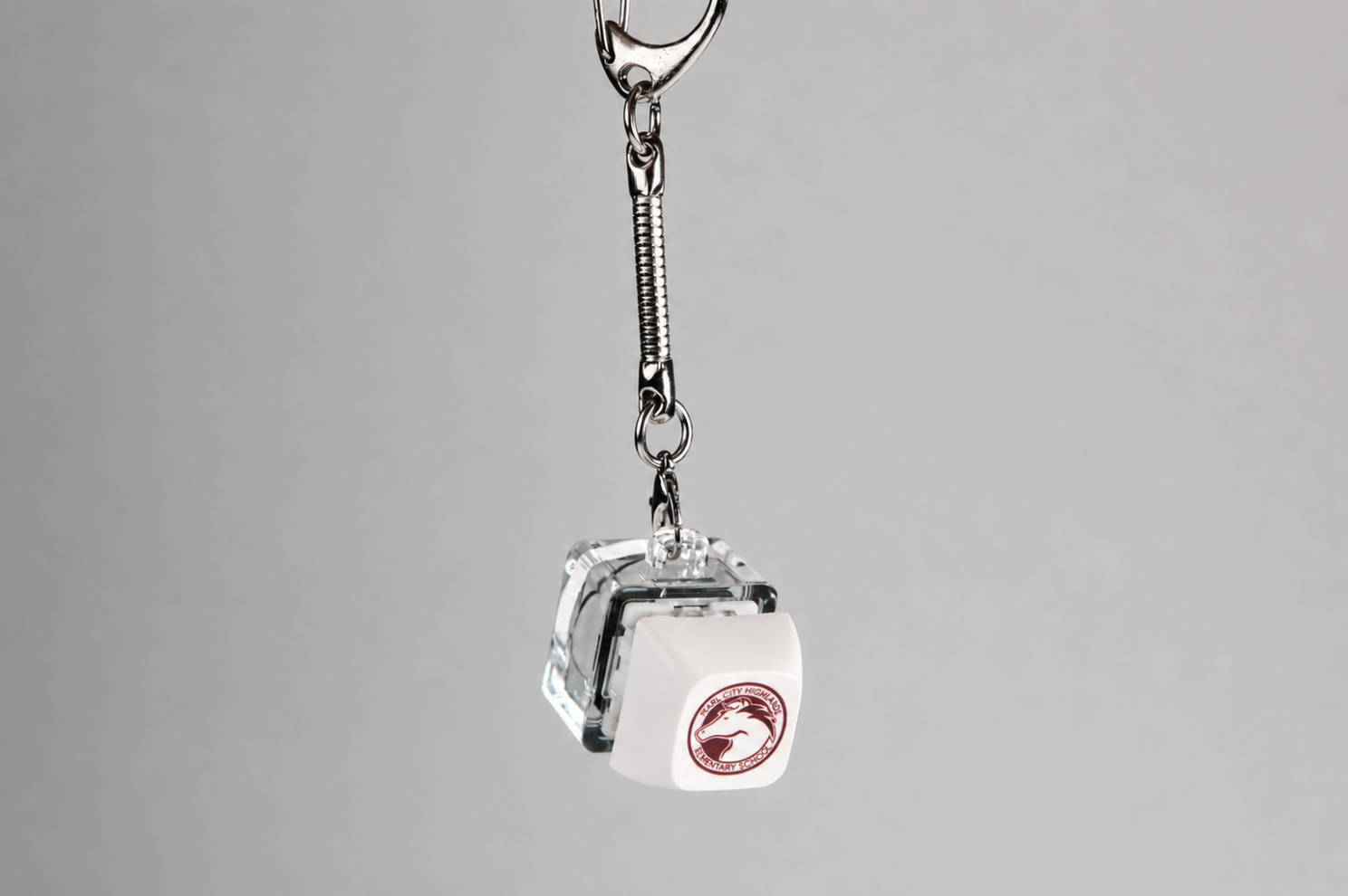
The attached keyring gives that interaction a portable format. It can be clipped to a backpack, pencil case, lanyard or keys rather than requiring permanent desk space. The mascot, click and attachment are not three unrelated features; each one supports the same idea of a small school item designed to be recognised, handled and carried.
Once an item is expected to travel, its physical design becomes just as important as its graphic design.
Design for Where It Will Live
A product intended for a backpack needs to be evaluated differently from something that will remain on a desk. Size, weight, attachment hardware, exposed edges and artwork durability all affect how practical it feels in daily use.
The school graphic also needs to remain readable at its real production size. A logo that looks clear on a large computer screen may lose fine lettering when reduced to a single keycap. Reviewing a physical sample allows the school to check the mascot, colour contrast and small text before approving the full order.
The sample should also be handled in the way a student might use it. Press the key repeatedly. Attach it to a bag. Check whether the clasp is easy to operate and whether the product feels secure while hanging. These tests connect the item’s intended afterlife to the production decision instead of treating sample approval as a visual check alone.
A product that passes those tests can then become more than an idea for a single event. It can provide a stable format that the school adapts over time.
Turn One Product Into a Repeatable School Format
Schools do not necessarily need a completely different giveaway for every event. A recognisable product format can remain consistent while selected details change.
The same tactile keycap construction could carry a different colour for each house, a graduating year, a club icon or a version of the mascot made for a specific event. The base, switch and keyring remain familiar, while the keycap provides enough space to distinguish one edition from another.
This creates continuity between campaigns and can simplify future design decisions. The school is no longer restarting with a blank product search each time. It is deciding what should change within an established format.
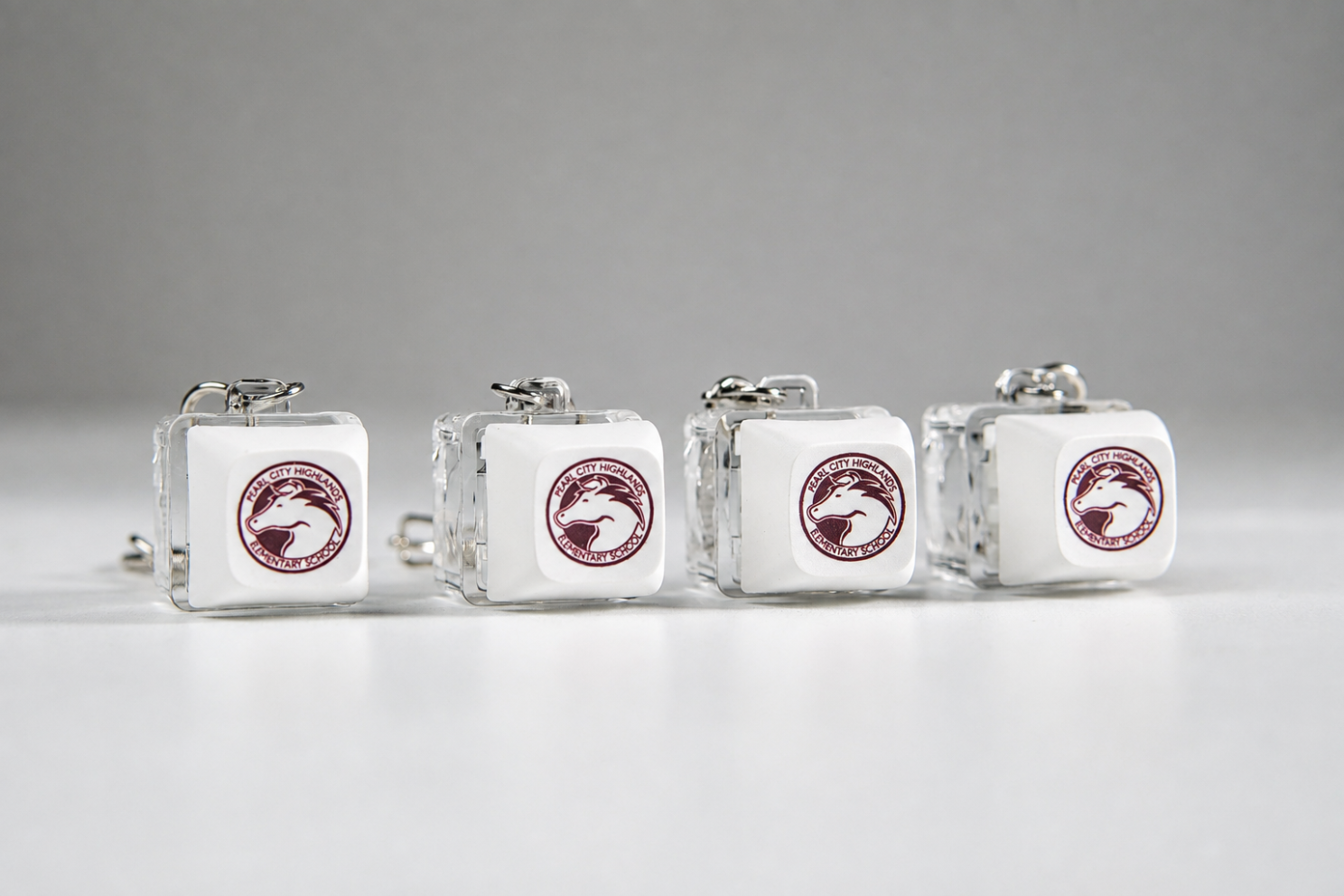
That does not automatically make the product collectible. Students may care about house colours, mascot variations or graduation years, or they may prefer something else entirely. The reliable way to find out is to involve them before the design is final.
Ask Students Before Deciding What They Want
The phrase “students actually want” should not be based only on what adults believe looks appealing. Even a small amount of student input can reveal whether an idea feels relevant or simply looks good in an approval document.
Schools do not need to offer unlimited customisation. They can show a small student group two or three realistic options and ask specific questions:
- Which symbol would you rather carry: the crest, mascot or club icon?
- Where would you attach or keep this item?
- Which colour feels most connected to your school or group?
- Would you prefer one shared design or different versions for houses, clubs or year groups?
The aim is not to hand the entire production decision to students. It is to test the assumptions behind the design while there is still time to adjust it.
Those answers lead naturally into four final checks before production.
Four Questions Before You Order
The decisions above can be reduced to four connected questions:
- What moment is the item marking? Define whether it is for welcoming, recognition, graduation, an event or another specific purpose.
- Which identity element matters most? Choose the mascot, crest, colour, year or group symbol that best fits that moment.
- Where will the product live afterwards? Check whether it belongs on a backpack, lanyard, desk or somewhere else in the student’s routine.
- What evidence supports the choice? Use student feedback and a physical sample rather than relying entirely on adult assumptions or a digital mockup.
These are not an additional checklist placed on top of the article. They summarise the same path followed by the Pearl City Highlands fidget: begin with the moment, select a recognisable identity, give the product an afterlife and test whether the idea works before committing to production.
A Small Object Can Carry a Specific Memory
The strength of the Pearl City Highlands fidget is not that it attempts to do everything. Each part has a clear role. The mascot identifies the school, the mechanical switch adds interaction and the keyring gives the item a practical place to go.
No giveaway can guarantee engagement, belonging or better student performance. A school can, however, improve the quality of the decision by understanding the occasion, involving the intended recipients and choosing a product that still makes sense after the distribution table has been packed away.
That is a more useful standard than asking which five products are currently popular. The better question is whether this particular item belongs in this particular student’s life.
Create School Merchandise Students Can Recognise and Use
GoblinTechKeys helps schools translate mascots, colours and event concepts into custom keycaps, tactile fidgets and repeatable merchandise formats.

Mission statement isn't a static asset you design once and forget. It is a live promise. In a fast-paced market where users have endless alternatives at their fingertips, authenticity isn't a design aesthetic—it’s the ultimate competitive advantage.
Mission statement isn't a static asset you design once and forget. It is a live promise. In a fast-paced market where users have endless alternatives at their fingertips, authenticity isn't a design aesthetic—it’s the ultimate competitive advantage.
Mission statement isn't a static asset you design once and forget. It is a live promise. In a fast-paced market where users have endless alternatives at their fingertips, authenticity isn't a design aesthetic—it’s the ultimate competitive advantage.
Heading 1
Heading 2
Heading 3
Heading 4
Heading 5
Heading 6
Lorem ipsum dolor sit amet, consectetur adipiscing elit, sed do eiusmod tempor incididunt ut labore et dolore magna aliqua. Ut enim ad minim veniam, quis nostrud exercitation ullamco laboris nisi ut aliquip ex ea commodo consequat. Duis aute irure dolor in reprehenderit in voluptate velit esse cillum dolore eu fugiat nulla pariatur.
Block quote
Ordered list
- Item 1
- Item 2
- Item 3
Unordered list
- Item A
- Item B
- Item C
Bold text
Emphasis
Superscript
Subscript

One Gift, Twelve Decisions: The 2026 Year End Corporate Gifting Checklist