How to Turn a Flat Idea Into a Custom 3D Product
See how logos, mascots and unexpected ideas are transformed into recognisable, functional and production-ready 3D desk products.
What Changes When an Idea Leaves the Screen?
A practical guide to preserving recognition, function and manufacturability when transforming logos, mascots and unconventional ideas into custom 3D desk products.
Flat artwork only has to work from the front. A physical product has to make sense from every angle, feel comfortable in the hand and, if it contains a switch or key, leave enough room for that interaction to work.
That is why turning a logo, mascot or unexpected reference into a 3D product is not as simple as adding thickness to an image. Details that look clear on a screen may become too small, too fragile or too crowded once the design is reduced to the size of a keycap, fidget or macropad. At the same time, simplifying the artwork too aggressively can remove the details that made the original idea recognisable.
The real design question is therefore not whether an idea can be made three dimensional. It is which parts must remain recognisable, and which parts need to change so the physical object can work. The rest of this guide follows one small set of examples through each stage of that process, from silhouette to prototype, so you can see how the same decisions play out at every step rather than treating each one as a separate case.
A Flat Design Is Only the Starting Point
A 2D design can use outlines, shadows and colour changes to suggest depth. Once it becomes a physical object, those visual shortcuts need to be translated into actual surfaces, layers and proportions.
A dark outline might become a separate outer frame. A coloured area may need to sit above or below another layer. A small illustration might need to become a simpler embossed detail. If the product contains a button or moving component, part of the artwork may also need to become functional. The goal is not to reproduce every line at the same height. It is to understand what the viewer notices first, what supports that recognition and what can be removed without changing the identity of the idea.
With that principle in mind, the next few sections work through it in order: first the outer shape, then how details sit in relation to one another, then whether the result still functions, and finally how to prototype it before committing to a production run.
Start With the Silhouette
Before considering surface details, look at the outer shape. A strong silhouette allows an object to remain recognisable from a distance and from different viewing angles. This is particularly important for small desk products because the finer details may not be visible until someone picks the item up.
Simple brand marks often translate well because their identity already depends on a clear outline. More detailed mascots, food items or pieces of hardware may need to be reduced to a few dominant shapes before they can become practical physical products.
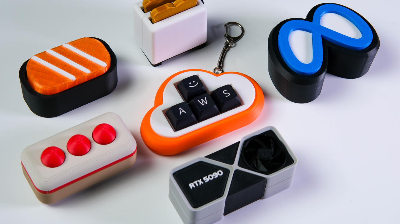
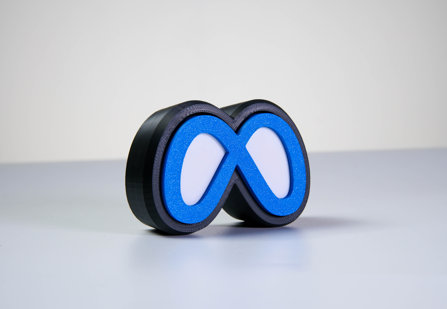
A Meta inspired design is a useful reference point here, and one we will come back to later in this guide. Its looping form and central negative spaces do most of the recognition work on their own. Preserving those proportions matters more than adding decoration to the surrounding surfaces, and it sets the pattern for everything that follows: get the outline right before touching anything else.
Use Depth to Create a Clear Reading Order
Once the silhouette works, the next decision is how the individual elements should sit in relation to one another. Some details can be raised above the surface, while others can be recessed, printed or produced as separate coloured components. These differences create a visual hierarchy that tells the eye what to notice first.
If every line and feature is given the same depth, the result may feel heavy or difficult to read. A stronger design usually establishes one dominant form, one supporting layer and a smaller number of surface details. Manufacturing method also affects what is practical. Formlabs identifies embossed and engraved details, wall thickness, clearance and overhangs as considerations specific to the manufacturing process. Protolabs similarly notes that text and lettering are often among the smallest features on a part and therefore require particular attention during design.
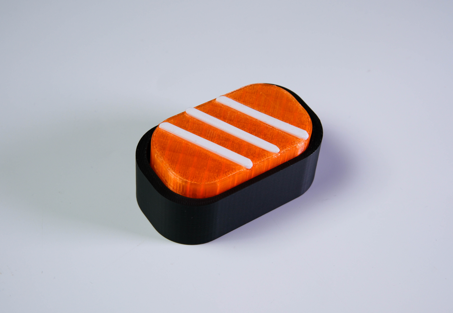
A sushi inspired fidget shows how this hierarchy works in practice, and how a familiar reference can be communicated with relatively few elements. Its rounded orange surface establishes the main form, while the raised white bands and contrasting black base complete the idea as supporting layers, without attempting to reproduce every detail of a real piece of sushi.
Function Must Survive the Sculpture
A custom 3D desk product still needs to perform its intended job, and this is where a strong silhouette and a clear reading order can still go wrong if function was not considered from the start.
For a clicky fidget like the sushi example above, the sculpted section must leave enough room for the key to travel and return without rubbing against the enclosure. The base needs to remain stable when pressed, and the shape should still feel comfortable when carried or held.
For a macropad, the design needs to protect access to every key, maintain suitable spacing between controls and leave ports or cables unobstructed. A recognisable shape is valuable, but not if it makes the product awkward to operate. This is why the product format should not be chosen only after the 3D artwork is finished. The intended interaction should influence the design from the beginning. A simple logo may work naturally as a shaped fidget, while a system of icons or workflow commands may be better suited to a macropad.
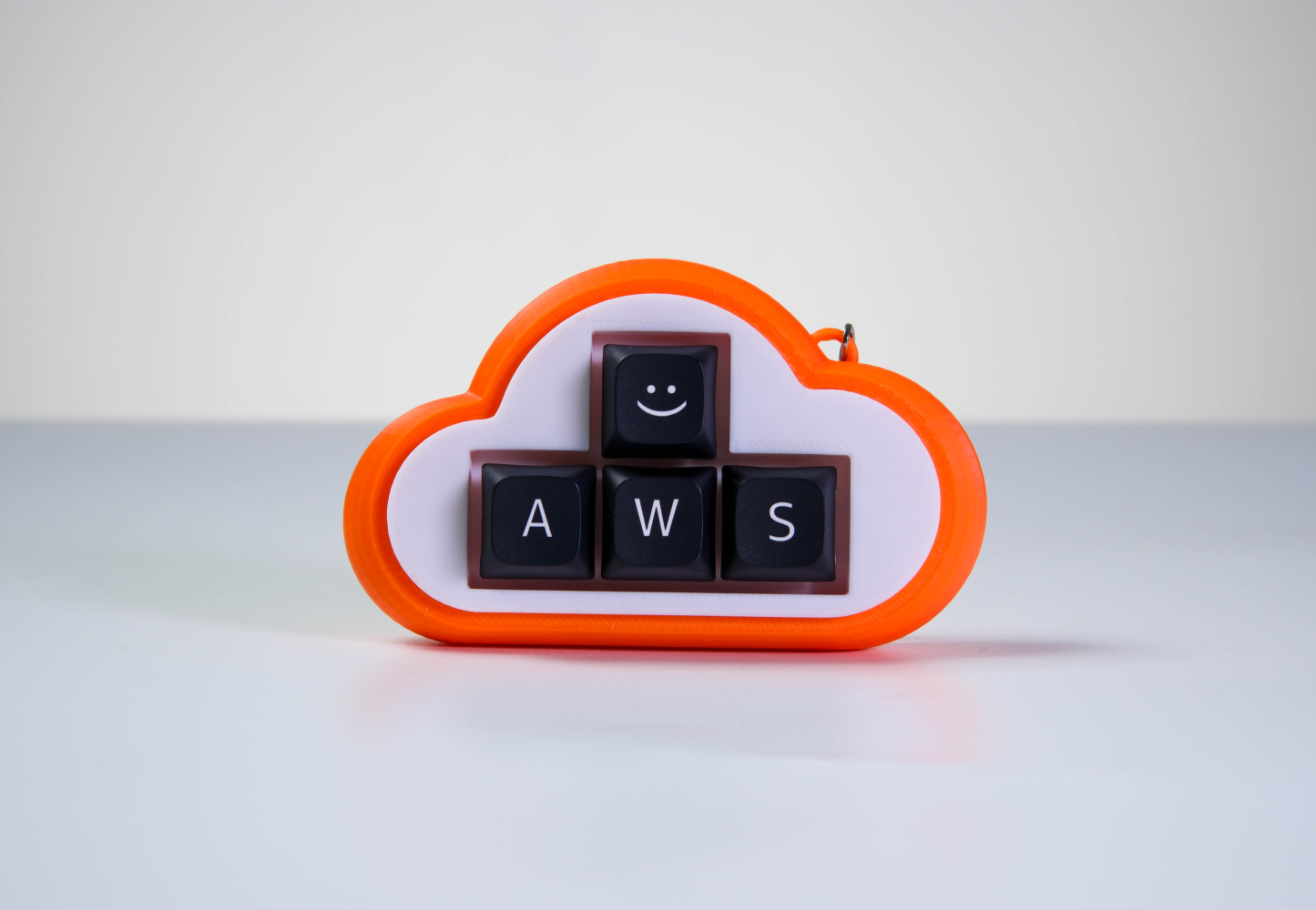
An AWS inspired design puts this into practice: the cloud silhouette establishes the overall identity, while the keys remain clearly separated and easy to reach. The branding surrounds the interaction instead of competing with it.
Simplify the Details Before Production Does It for You
One of the hardest parts of translating a reference into 3D is deciding what to remove. Thin lines may disappear when printed. Small gaps can close. Narrow raised features may become fragile, and detailed text may lose clarity when the entire design is reduced.
The solution is not simply to make everything larger. Enlarging every feature can make the object feel crowded and distort the original proportions. Instead, identify the few visual cues that carry most of the recognition. It is the same instinct that made the sushi fidget work with only a handful of shapes.
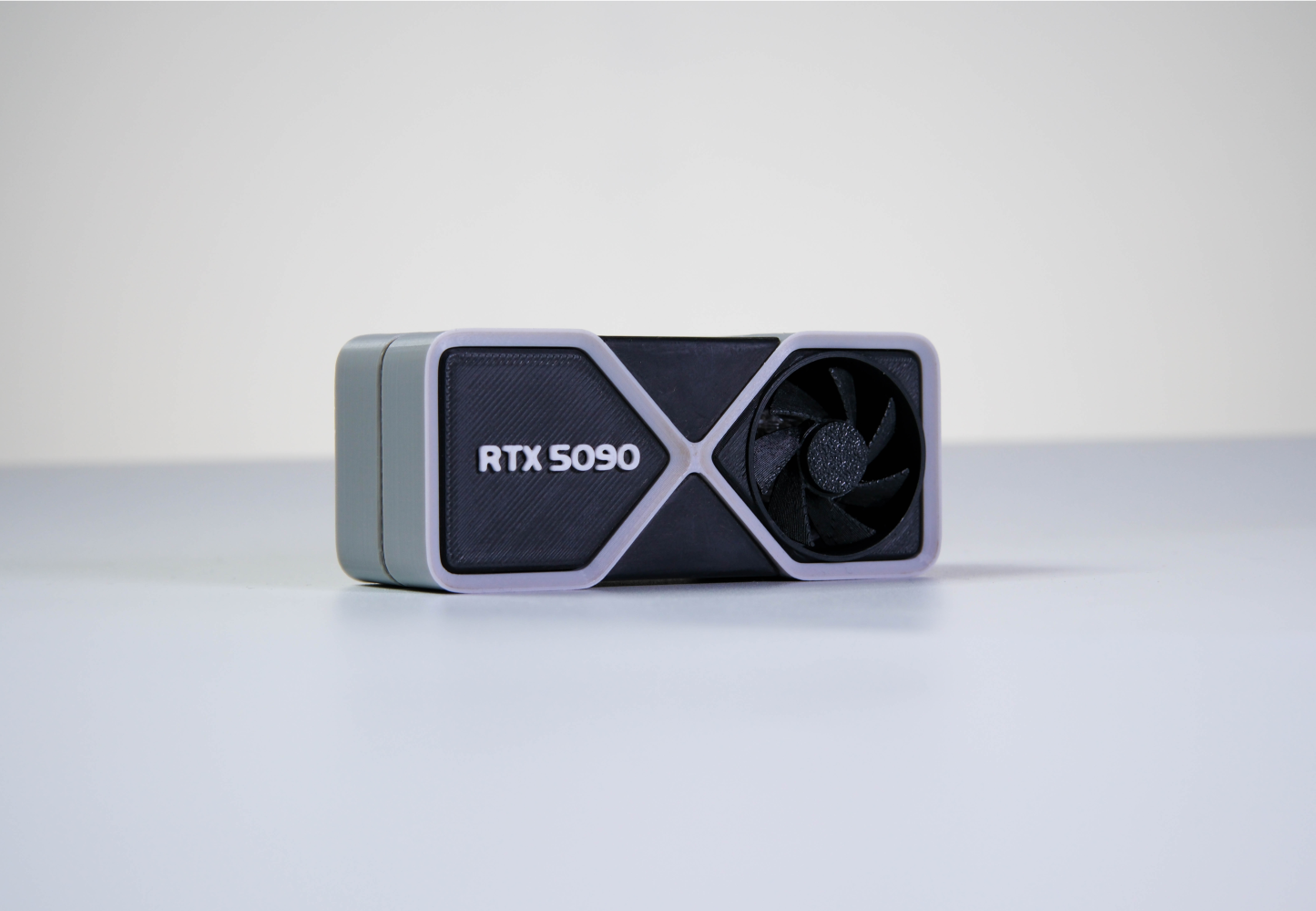
A graphics card inspired design makes this especially clear. Its frame, fan, contrasting panels and RTX 5090 label provide enough information to communicate the reference. Reproducing every vent, connector and technical surface would add complexity without necessarily making the object more recognisable. This simplification should happen deliberately during design, not accidentally during production.
A Prototype Answers Questions a Rendering Cannot
A digital model can show overall shape, colour placement and how the components are expected to fit together. It cannot fully communicate how large the product feels in the hand, how stable it is when pressed or whether a raised feature catches against a finger.
A physical prototype reveals those differences. It allows the team to test scale, balance, key movement, visible print lines, surface finish and the relationship between decorative and functional parts, this time under real handling rather than on screen. IDEO describes early prototyping as a way to make ideas tangible, learn through testing and reduce risk before committing more time and resources. For a custom 3D product, that means the first sample should be treated as something to learn from rather than a miniature version of the final production run.
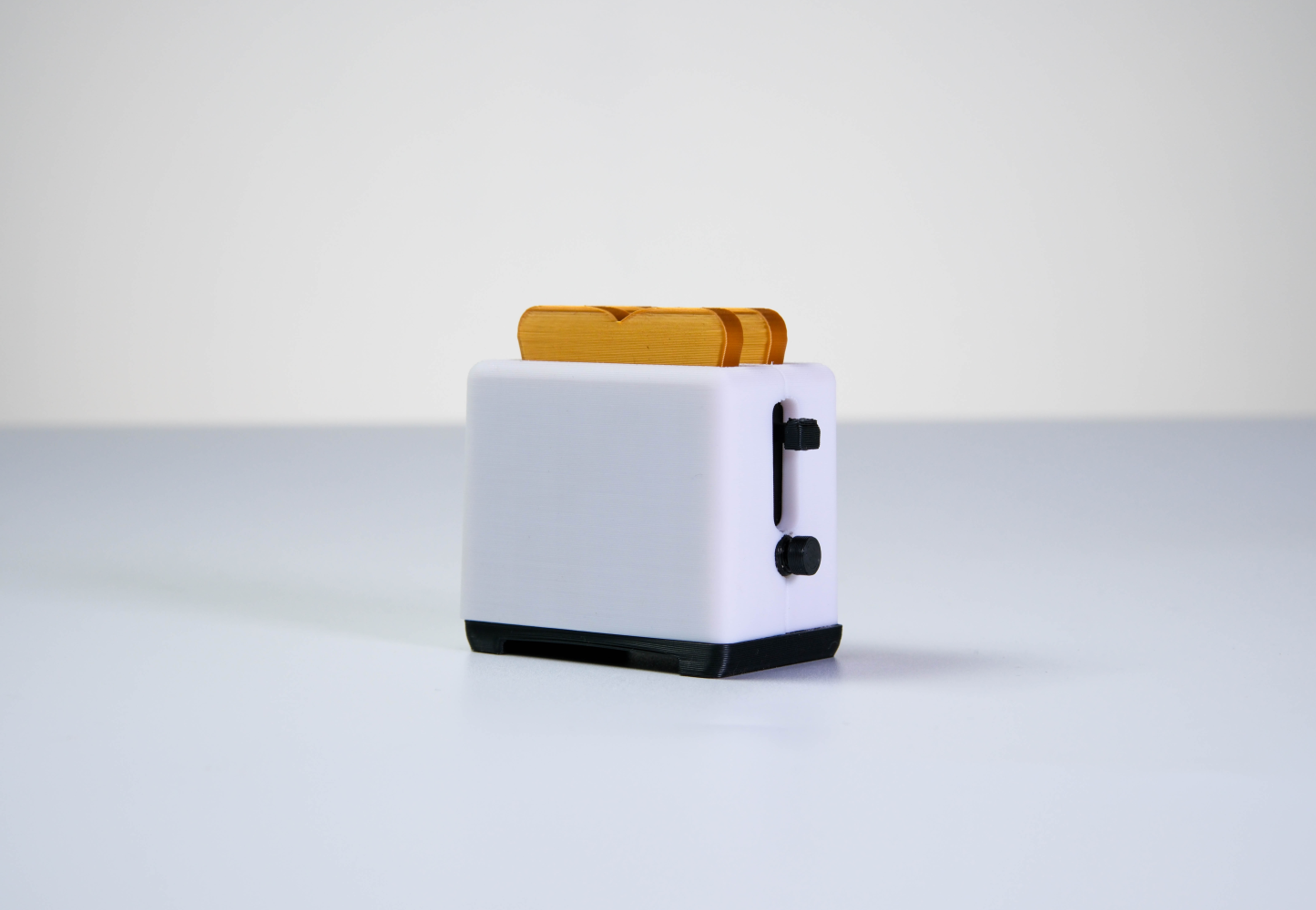
A toaster shaped design brings all of this together well. It may look immediately familiar in a rendering, but a physical sample is still needed to confirm whether the proportions feel balanced, whether the interactive area moves correctly and whether the product remains stable during use, the same checks this guide has followed from the silhouette stage onward.
Bringing It Together: What to Put in a 3D Design Brief
Everything above comes down to a small number of questions worth answering before development begins, so that silhouette, layering, function and simplification are decided on purpose rather than discovered late:
- What must remain recognisable? Identify the essential outline, colours, symbols or character features.
- How will the product be used? Confirm whether it will be pressed, carried, attached to a keychain or kept on a desk.
- Which areas need to move? Mark the keys, switches, knobs or other interactive components.
- How large should it feel? Consider the hand, pocket, keyboard or desk space where it will be used.
- Which details can be simplified? Separate essential identity cues from decoration.
- How should colour be divided? Decide which areas need separate components, printing or surface treatment.
- What needs to be checked in the sample? Include movement, balance, colour, finish, fit and recognisability.
- Where will the product be distributed? An event giveaway, employee gift and community product may create different requirements.
A finished 3D file is not required to begin a custom project. A sketch, logo, photograph or rough visual reference can be enough, provided the brief answers these questions, giving the designer room to adapt the idea without losing the reason it was chosen in the first place.
The Best 3D Version Does Not Copy Every Line
Making an idea three dimensional does not automatically make it more interesting. The value comes from deciding what depth adds to the experience. The strongest designs preserve the features people recognise, simplify the details that will not translate well and leave enough space for the product to remain useful. They look considered from more than one angle and still make sense when someone presses, carries or handles them.
A flat logo, like the Meta mark that opened this guide, may become a shaped enclosure. A mascot may become a sculpted key. A cloud may become a macropad, and an unexpected object such as a toaster or graphics card may become something entirely new. The final result should not feel like an image that has simply been made thicker. It should feel like the idea was always meant to become an object.
Bring Us the Sketch
You do not need a completed 3D model to start. Send us the logo, mascot, reference image or rough idea, and GoblinTechKeys can help translate it into a custom 3D keycap, clicky fidget or macropad.

Mission statement isn't a static asset you design once and forget. It is a live promise. In a fast-paced market where users have endless alternatives at their fingertips, authenticity isn't a design aesthetic—it’s the ultimate competitive advantage.
Mission statement isn't a static asset you design once and forget. It is a live promise. In a fast-paced market where users have endless alternatives at their fingertips, authenticity isn't a design aesthetic—it’s the ultimate competitive advantage.
Mission statement isn't a static asset you design once and forget. It is a live promise. In a fast-paced market where users have endless alternatives at their fingertips, authenticity isn't a design aesthetic—it’s the ultimate competitive advantage.
Heading 1
Heading 2
Heading 3
Heading 4
Heading 5
Heading 6
Lorem ipsum dolor sit amet, consectetur adipiscing elit, sed do eiusmod tempor incididunt ut labore et dolore magna aliqua. Ut enim ad minim veniam, quis nostrud exercitation ullamco laboris nisi ut aliquip ex ea commodo consequat. Duis aute irure dolor in reprehenderit in voluptate velit esse cillum dolore eu fugiat nulla pariatur.
Block quote
Ordered list
- Item 1
- Item 2
- Item 3
Unordered list
- Item A
- Item B
- Item C
Bold text
Emphasis
Superscript
Subscript
One Gift, Twelve Decisions: The 2026 Year End Corporate Gifting Checklist