
What Should a Mechanical Keyboard for Mac Users Get Right?
A practical guide to the layout, profile, sound and branding choices that help a custom mechanical keyboard feel familiar to Mac-based teams.
Mac Familiarity Starts With Muscle Memory
A practical guide to the layout, profile, sound and branding choices that help a custom mechanical keyboard feel familiar to Mac-based teams.
Put Command in the wrong place and a Mac user will notice before the first sentence is finished.
That is because a familiar keyboard is not defined by colour alone. It is built around small habits: where the modifier keys sit, what the legends say, which navigation keys remain available and how far each key travels when pressed.
A keyboard can look perfectly at home beside a Mac and still make its user hesitate. It can also feel mechanically satisfying without fitting the shortcuts and movements that person has repeated for years.
When we developed our 75% low-profile metal keyboard, the useful question was not how to make a mechanical keyboard look more like a laptop keyboard. It was this:
Which parts of the Mac experience should remain familiar, and where can the typing experience become more personal?
Mac Familiarity Starts With Muscle Memory
Mac users do not simply recognise a keyboard by its silver finish or clean keycaps. They recognise it through the controls they reach for without looking.
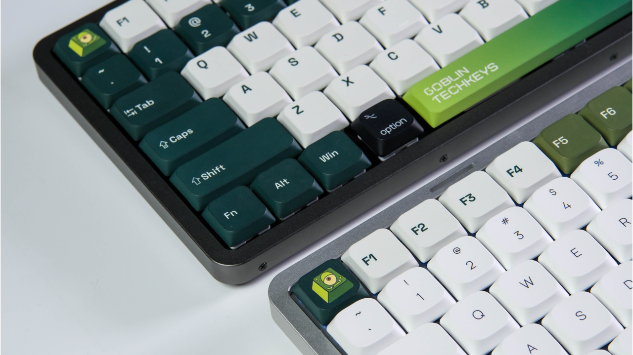
Command and Option are the clearest examples. They sit at the centre of many everyday Mac shortcuts, from copying and saving to changing applications and opening search. Return, Delete and the function row also carry labels and behaviours that users expect to find quickly.
A Windows keyboard can often be configured to work with macOS. Apple even allows users to change the actions assigned to modifier keys. But technical compatibility and immediate familiarity are not the same thing.
If a keyboard is being given to a team rather than chosen by an individual enthusiast, the legends should make sense as soon as the box opens. The recipient should not have to remember that a key labelled Alt is acting as Option, or that another symbol now performs the Command function.
That is why the Mac version should be treated as its own layout decision, not just a different set of colours.
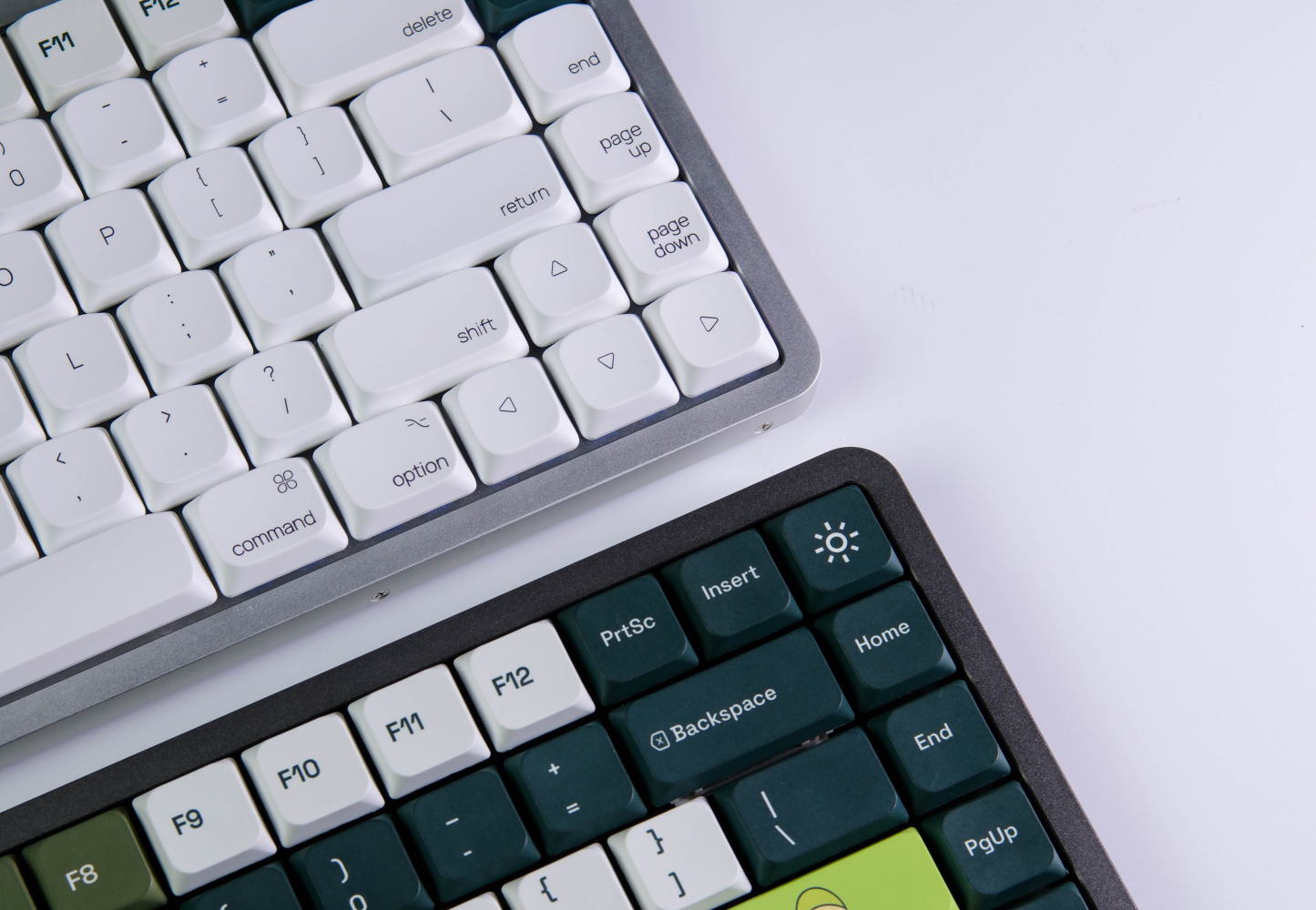
Why 75% Can Be a Practical Middle Ground
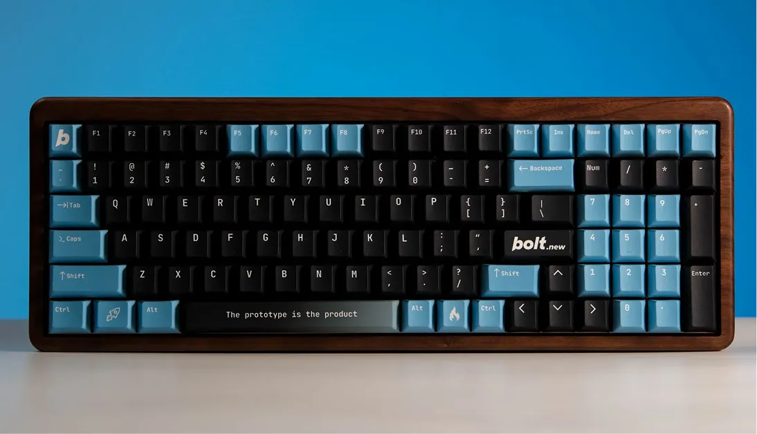
Keyboard percentages describe how much of a traditional layout remains, not a promise that every board arranges its keys the same way. A 75% layout typically keeps the main typing area, arrow keys and function row while dropping the number pad and tightening the navigation cluster, which is why it reads as noticeably narrower than a full-size board without shrinking down to only letters and numbers.
For many desk-based roles, that narrower footprint is the whole appeal: more room for a mouse, a notebook or a drawing tablet. It just is not the right answer for everyone. Someone who works heavily in spreadsheets or numerical entry may miss the number pad every day; a designer, developer or writer may barely notice it is gone.
The layout question a team actually needs to answer is not “does 75% look compact enough for the photo,” but “what would people miss if the number pad disappeared.” That is a smaller question, and a much more useful one.
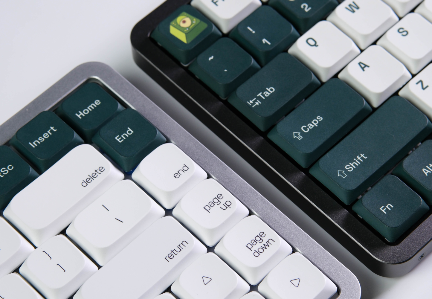
Low Profile Changes More Than the Silhouette
Low-profile keyboards make a different trade. Shorter switches and keycaps reduce the overall height of the board, bringing it visually closer to the slim equipment many Mac users already keep on their desks. But the change is not merely cosmetic. The shorter construction affects key travel, actuation, sound and feedback. Someone moving from a laptop keyboard may find the transition relatively familiar; someone used to a taller mechanical board may need time to adjust.
This is where the opening question about familiarity and personal preference becomes more practical. A low-profile board stays closer to the laptop typing experience many Mac users already know. A traditional mechanical profile generally leaves more room for switch changes, keycap sets and deeper customisation later. Neither is automatically better. They answer different preferences, and a team should understand that difference before choosing between them.
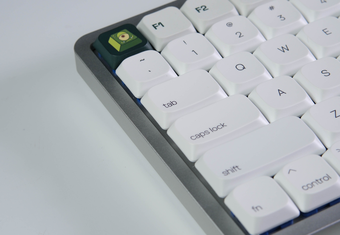
There Is No Universal “Mac Sound”
Sound is usually where the personal side of this keyboard is supposed to show up, and “thock” is the word every brief reaches for first. It is worth being careful with that word, because sound is not something one material or component decides on its own. Switch, keycap, plate, case, internal dampening, the desk it sits on and even how a person types all shape what comes out, and a low-profile board has different physical limits from a taller mechanical one to begin with.
That is why a recording of the actual production sample says more than a description ever could. It also matters more for shared offices than a single adjective suggests: quieter tactile feedback is often the better fit for an open room than a louder, more distinctive click. The useful brief is not “make it sound premium.” It is “decide what level and type of feedback fits the room it will live in.”
Metal Should Support the Experience
Metal changes the keyboard in a different way. It gives the enclosure more visual definition and creates a more substantial feel when the product is picked up. For corporate gifting, that physical impression matters because recipients experience the enclosure, finish and assembly before studying the smaller custom details.
What metal should not become is a stand-in for every other quality claim. Weight, surface finish, internal construction and production consistency still need to be checked separately, and a metal case alone does not guarantee a particular lifespan, sound or level of comfort. The material earns its place when it supports the product as a whole: a compact format, clear legends and a typing feel suited to the team receiving it.
Mixed Teams Need More Than One Legend Set
Many companies do not run on one system. A creative team may be mostly on Mac, while finance, operations or technical staff use Windows machines.
Sending the same printed layout to everyone can create unnecessary friction even when the keyboard can technically connect to both systems.
There are several practical ways to handle this:
- Ask employees which operating system they use before production.
- Produce separate Mac and Windows legend variants.
- Include the relevant replacement modifier keycaps when the construction allows it.
- Confirm how the modifier keys are mapped before final approval.
This is a small operational step, but it changes the experience from “a keyboard the company ordered” to “a keyboard prepared for the way I work.”
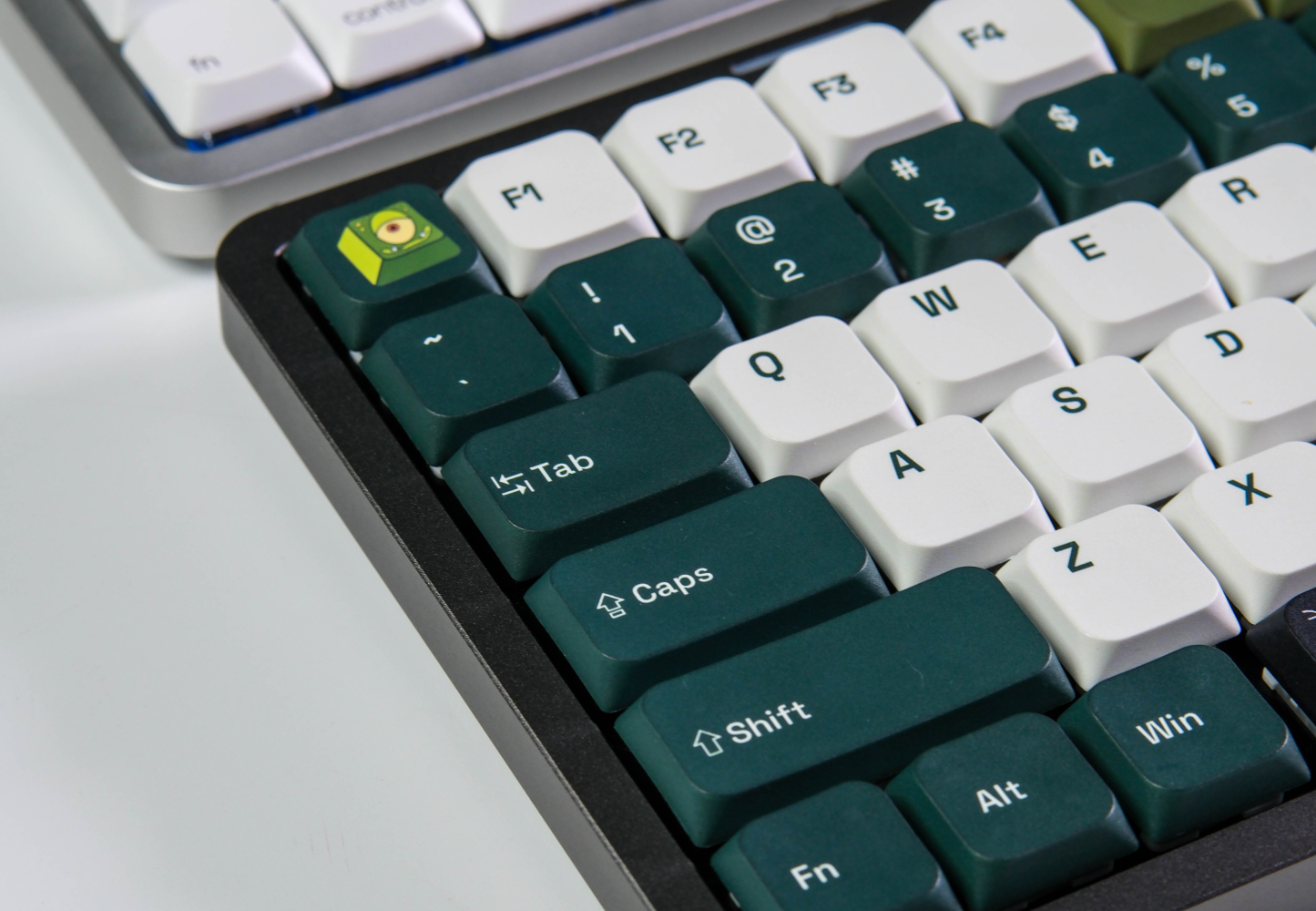
Brand the Keyboard Without Turning It Into a Billboard
A keyboard offers plenty of branding space. That does not mean every key needs to carry a logo.
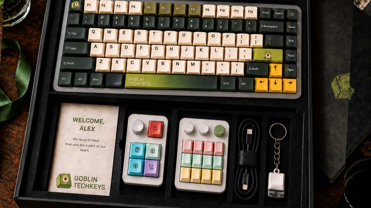
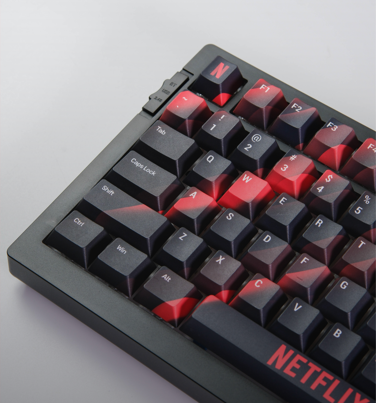
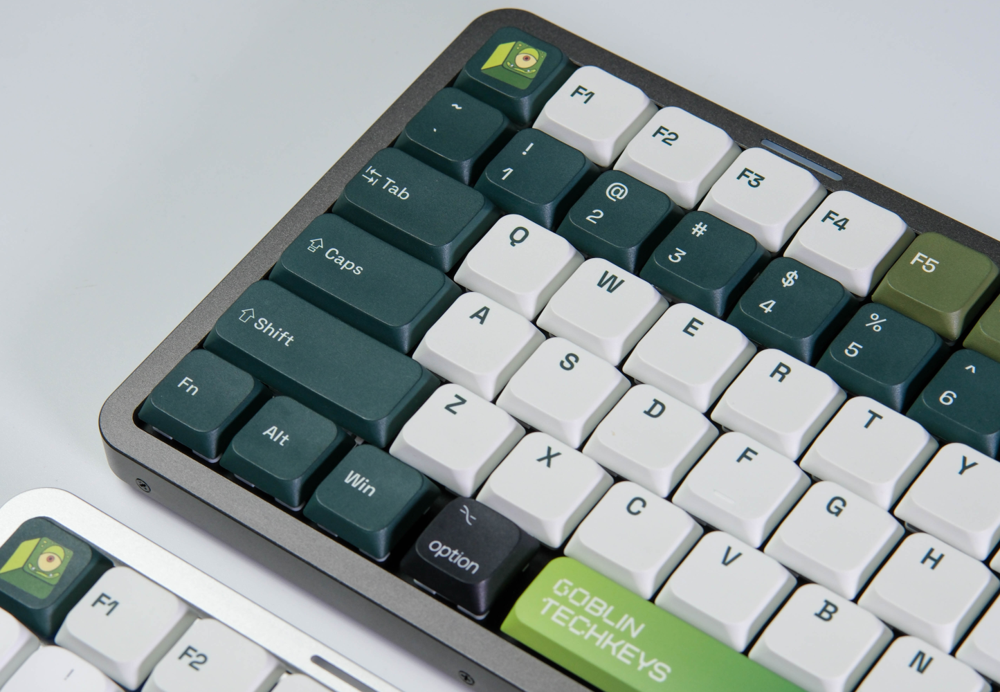
Start with the colour system. A controlled palette can establish the brand across the entire board before any logo appears. Then choose one or two high-value locations, such as the Escape key, Enter key or spacebar, for the strongest graphic treatment.
Functional legends should remain easy to read. Command, Option, letters and navigation keys are working controls first. If branding makes them slower to recognise, the design has taken too much space from the product.
A useful hierarchy might include:
- Brand colours across the keycap groups
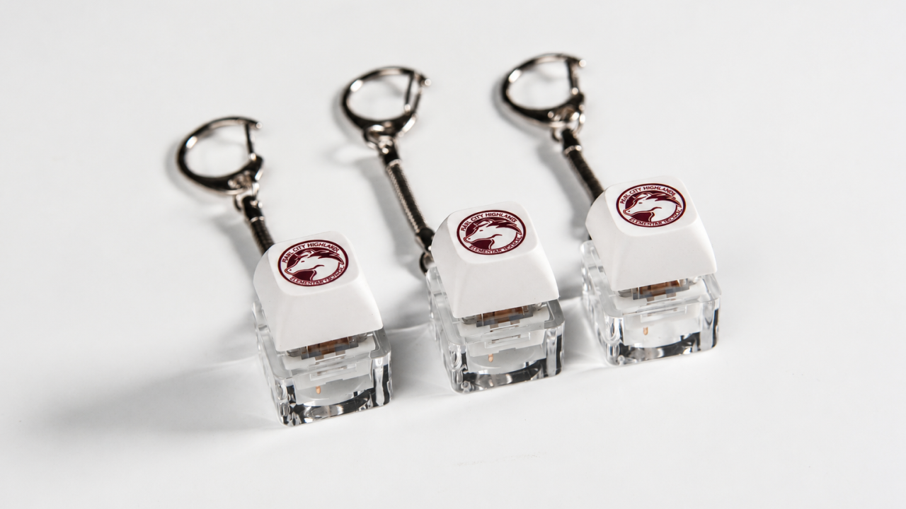
- One signature illustrated or logo key
- A wordmark on the spacebar or enclosure
- Clear functional legends everywhere else
- Packaging that continues the same visual language
This gives the keyboard a distinct identity without making every keystroke feel like an advertisement.
A Better Brief for a Mac-Based Team
Before requesting mock-ups or choosing colours, answer these questions:
- Which operating systems does the team actually use? Separate Mac and Windows users if necessary.
- Does anyone rely on a number pad? Do not remove it simply because a compact keyboard photographs well.
- Would the team prefer low-profile or traditional mechanical switches? If possible, offer a sample or a small set of switch choices.
- How quiet does the keyboard need to be? A private home office and a shared workspace may require different decisions.
- Which legends must remain familiar? Confirm modifier keys, navigation keys and function-row behaviour.
- Where should the brand be most visible? Choose a small number of locations rather than filling every surface.
- Will the keyboard stay at one desk or travel between locations? This may influence layout, weight and packaging.
The answers turn an aesthetic idea into a usable product brief. They also make sampling and approval more meaningful because the team is checking decisions tied to real work, not just choosing the most attractive rendering.
The Right Keyboard Feels Familiar Before It Feels Branded
A mechanical keyboard for Mac users does not need to imitate Apple hardware, and it does not need to reject everything familiar about it.
The strongest design keeps the parts users depend on: recognisable modifier keys, clear legends and a layout that fits their daily tasks. It then adds the elements that make a custom mechanical keyboard worthwhile, such as a chosen typing feel, a compact format, considered materials and a brand identity built into the product.
That balance matters even more when the keyboard is a corporate gift. The recipient did not choose it from hundreds of options. The company chose it on their behalf.
The goal is therefore not to build the “perfect keyboard for every Mac lover.” It is to understand a particular team well enough to make the right set of choices for them.
Build a Keyboard Around the Way Your Team Works
Tell us which systems your team uses, what layout they need and how you want the brand to appear. GoblinTechKeys can help translate those requirements into a custom keyboard concept, sample and production plan.

Mission statement isn't a static asset you design once and forget. It is a live promise. In a fast-paced market where users have endless alternatives at their fingertips, authenticity isn't a design aesthetic—it’s the ultimate competitive advantage.
Mission statement isn't a static asset you design once and forget. It is a live promise. In a fast-paced market where users have endless alternatives at their fingertips, authenticity isn't a design aesthetic—it’s the ultimate competitive advantage.
Mission statement isn't a static asset you design once and forget. It is a live promise. In a fast-paced market where users have endless alternatives at their fingertips, authenticity isn't a design aesthetic—it’s the ultimate competitive advantage.
Heading 1
Heading 2
Heading 3
Heading 4
Heading 5
Heading 6
Lorem ipsum dolor sit amet, consectetur adipiscing elit, sed do eiusmod tempor incididunt ut labore et dolore magna aliqua. Ut enim ad minim veniam, quis nostrud exercitation ullamco laboris nisi ut aliquip ex ea commodo consequat. Duis aute irure dolor in reprehenderit in voluptate velit esse cillum dolore eu fugiat nulla pariatur.
Block quote
Ordered list
- Item 1
- Item 2
- Item 3
Unordered list
- Item A
- Item B
- Item C
Bold text
Emphasis
Superscript
Subscript
One Gift, Twelve Decisions: The 2026 Year End Corporate Gifting Checklist