What Makes Swag Feel Made for Developers?
A Buildkite keycap project shows why developer merchandise works best when the product, visual language and packaging all begin with the audience.
Start With the Audience, Not the Catalogue
A Buildkite keycap project shows why developer merchandise works best when the product, visual language and packaging all begin with the audience.
Developer merchandise has a simple relevance test.
If the product feels disconnected from the way its audience works, the logo has to do all the explaining. If the object already belongs in that audience's world, recognition begins before anyone reads the brand name.
That is what makes a custom keycap interesting. It is small, but it sits inside a much larger routine. For people who spend their day building, testing and shipping software, the keyboard is not a decorative prop. It is part of the work.
Our project with Buildkite offers a useful example. The important idea was not simply to place branding on a keycap. It was to create merchandise that felt specific to the developer community receiving it.
Start With the Audience, Not the Catalogue
Merchandise planning often begins with a list of available products. Teams compare drinkware, tote bags, notebooks and chargers, then ask where the logo should go.
That approach is efficient, but it starts one step too late.
A stronger first question is:
What does this audience already keep close?
For a developer community, the answer may include keyboards, desk mats, cables, tools or objects connected to familiar technical habits. That does not mean every developer wants the same thing. It means the product choice can begin with a real context instead of a generic assumption.
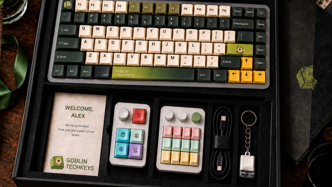
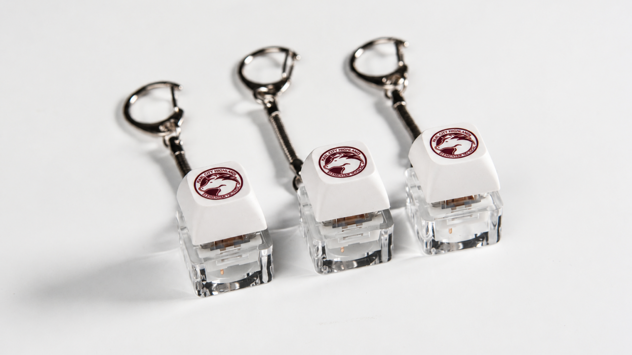
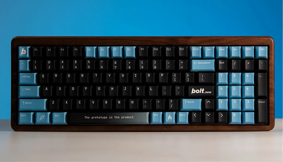
Keycaps make that principle unusually visible. They are not designed for everyone, and that is part of their strength. For mechanical keyboard users, a keycap is immediately understandable, easy to personalise and small enough to add to an existing setup.
Specific merchandise may reach a narrower audience than a universal giveaway. But when the audience fit is strong, the object needs less explanation and the branding feels less forced.
A Small Product Can Carry a Specific Idea
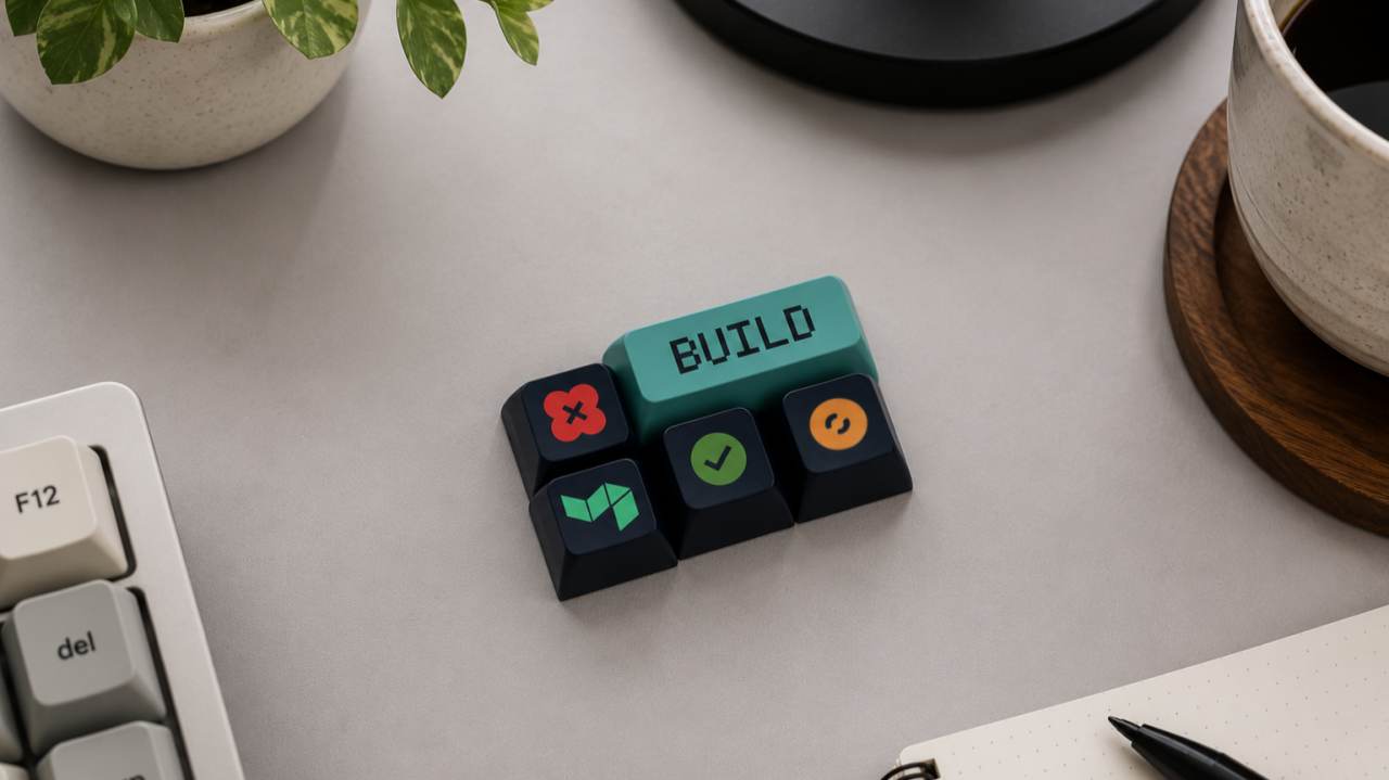
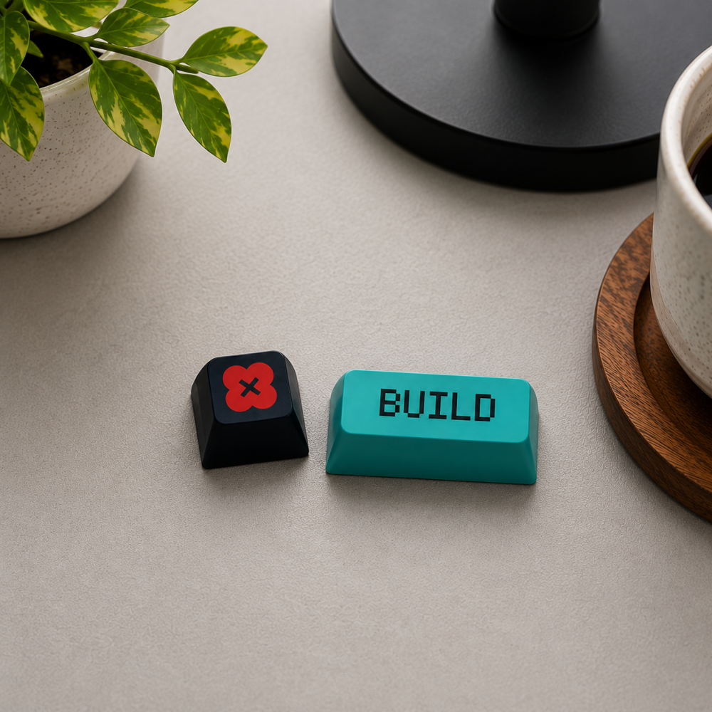
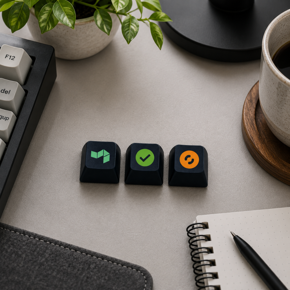
For Buildkite, we created a collection of custom keycaps using recognisable colours, symbols and a larger turquoise BUILD key.
"BUILD" is more than a piece of brand copy in this context. It is language that already belongs naturally in a developer workflow. The word connects the physical product to both the company and the work its community performs.
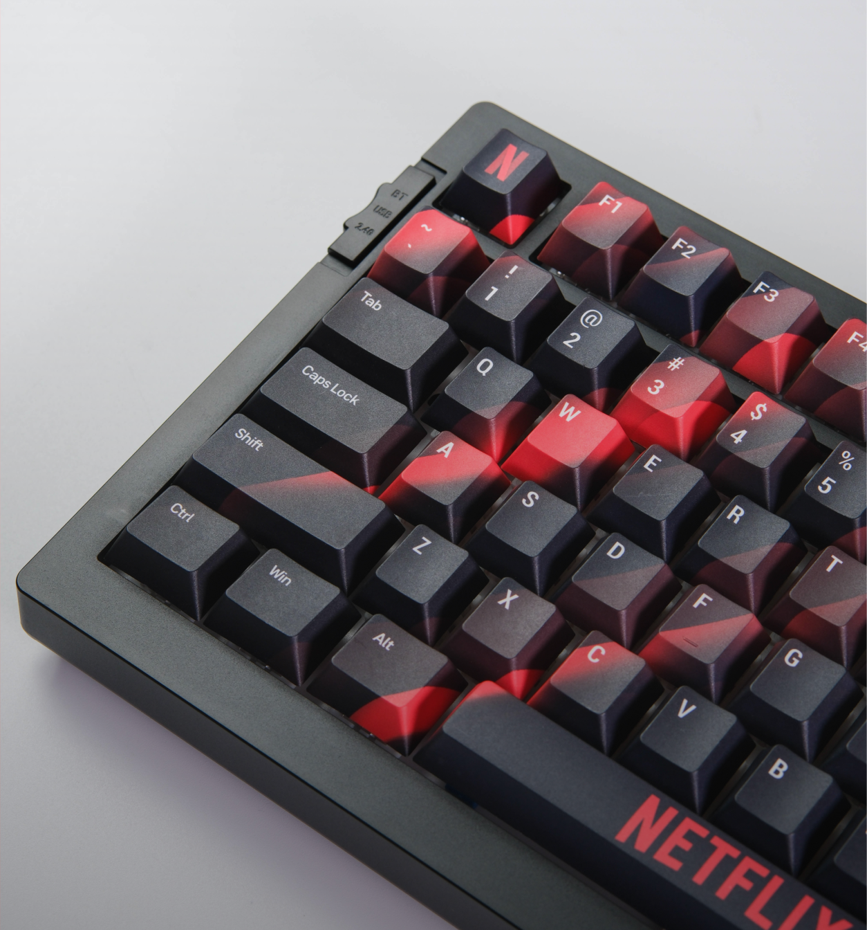
The supporting keycaps use simple graphic marks and bold colour against dark surfaces. Together, they feel like a coordinated set rather than several unrelated promotional pieces.
This is one reason small merchandise can work well. There is very little room for unnecessary information. Every colour, symbol and word has to earn its place.
Design for Recognition and Real Use
A branded keycap has two jobs. It needs to look like the brand, and it still needs to feel at home on a keyboard.
That balance changes the design process. A logo may look perfectly clear on a presentation slide but lose definition once it is reduced to the surface of a 1U keycap. Fine lines can disappear, several colours can compete, and an oversized mark can make the key feel more like an advertisement than part of a setup.
Three design decisions matter most:
- Use recognisable cues: Choose the symbol, word or colour the intended audience is most likely to understand.
- Protect legibility: Simplify details so the artwork stays clear at keycap scale.
- Design as a collection: Let multiple keys share a colour system, icon style or visual rhythm.
Compatibility matters too. Before production, confirm the intended key size, keyboard layout, switch compatibility and the position where the recipient is expected to use it.
A beautiful keycap is not useful if it does not fit the keyboard it was designed for.
Packaging Is Part of the Product Decision
Small merchandise can easily feel like a loose sample if the packaging has not been considered.
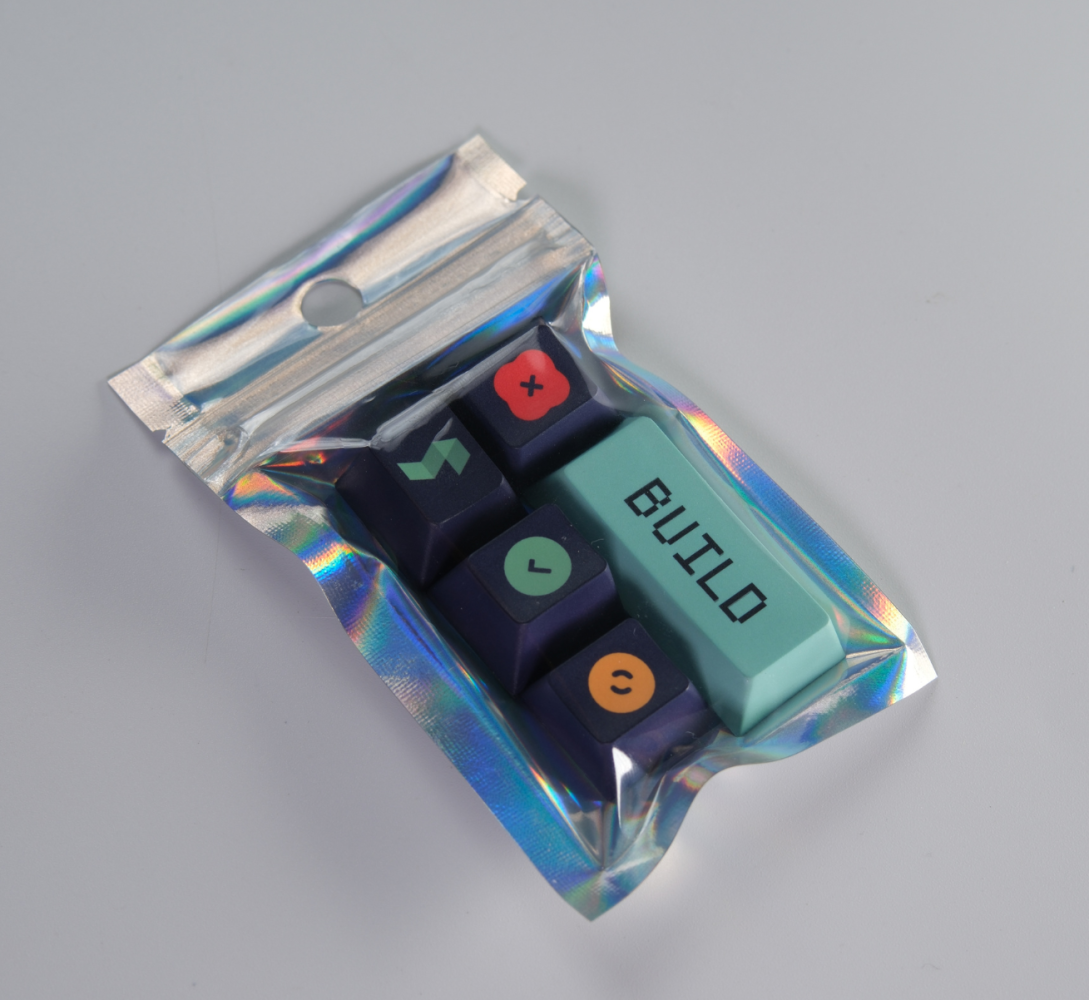
For this project, the keycaps were presented together in a holographic pouch. The reflective finish created contrast with the dark keycaps and turned the separate pieces into a single gift set.
The pouch did not need a complicated unboxing sequence. Its job was straightforward: hold the collection together, protect it during distribution and make the first reveal feel intentional.
That distinction matters at events. Attendees often receive several items in a short period. Packaging helps them understand whether an object is a random giveaway, a component that requires explanation or a complete set worth looking at more closely.
A Reorder Is Useful Evidence, Not the Whole Story
Buildkite later returned for another keycap order.
That is meaningful, but it is important to describe exactly what it tells us.
A reorder does not prove that every recipient installed a keycap, kept it for months or remembered the brand because of it. Those conclusions would require recipient feedback, photographs, surveys or other post-event data.
What the reorder does show is more practical. The format cleared the first round of design, approval, production and distribution well enough to be selected again. It also suggests that the product was repeatable without rebuilding the entire concept from the beginning.
For merchandise teams, that kind of continuity is valuable. A strong core format can return for another conference, community programme or campaign while allowing selected graphics, colours or packaging details to change.
Four Questions Before Choosing Developer Merchandise
Looking back at the Buildkite project, the same four questions decided almost every choice along the way.
1. Does the Product Belong in Their Environment?
Think about where the audience spends its time and what already lives there. A desk-related product makes sense only when it connects naturally to that environment. For Buildkite, that environment was the keyboard itself, which is why a keycap needed no extra explanation to feel relevant.
2. Is the Reference Obvious to the Intended Recipient?
Technical language, icons and inside references can make merchandise feel specific, but only when the audience understands them. The goal is recognition, not a puzzle. The word "BUILD" worked for exactly this reason: it is a term developers already use, not a phrase invented for the merchandise.
3. Can the Branding Support the Object?
Branding should make the product more distinctive without overwhelming its function or form. Sometimes one strong colour or word carries more identity than several logos. The turquoise BUILD key is the clearest example of this: one bold colour choice carried more identity than a printed logo could have on a surface that small.
4. Can the Idea Return in Another Form?
A useful merchandise system should leave room for new colourways, icons, campaigns or packaging without losing its core identity. Buildkite's reorder is the proof of this in practice: the same format returned with different graphics and was still instantly recognisable as the same collection.
The Best Developer Swag Feels Like It Belongs
The main lesson from this project is not that every developer programme needs a custom keycap.
It is that merchandise becomes more interesting when the product choice reflects the people receiving it. For Buildkite's community, keyboard culture, familiar developer language and a compact desk format gave the design a clear place to begin.
The product was small. The thinking behind it was specific.
That is often the difference between merchandise that merely carries a logo and merchandise that feels as though it was made for a particular community.
Create Merchandise Around Your Community
Tell us who you are designing for, where the product will be distributed and what makes that audience distinct.
GoblinTechKeys can help turn those details into custom keycaps, packaging and desk products built around your brand.

Mission statement isn't a static asset you design once and forget. It is a live promise. In a fast-paced market where users have endless alternatives at their fingertips, authenticity isn't a design aesthetic—it’s the ultimate competitive advantage.
Mission statement isn't a static asset you design once and forget. It is a live promise. In a fast-paced market where users have endless alternatives at their fingertips, authenticity isn't a design aesthetic—it’s the ultimate competitive advantage.
Mission statement isn't a static asset you design once and forget. It is a live promise. In a fast-paced market where users have endless alternatives at their fingertips, authenticity isn't a design aesthetic—it’s the ultimate competitive advantage.
Heading 1
Heading 2
Heading 3
Heading 4
Heading 5
Heading 6
Lorem ipsum dolor sit amet, consectetur adipiscing elit, sed do eiusmod tempor incididunt ut labore et dolore magna aliqua. Ut enim ad minim veniam, quis nostrud exercitation ullamco laboris nisi ut aliquip ex ea commodo consequat. Duis aute irure dolor in reprehenderit in voluptate velit esse cillum dolore eu fugiat nulla pariatur.
Block quote
Ordered list
- Item 1
- Item 2
- Item 3
Unordered list
- Item A
- Item B
- Item C
Bold text
Emphasis
Superscript
Subscript
One Gift, Twelve Decisions: The 2026 Year End Corporate Gifting Checklist