
What a Reorder Can Tell You About Event Merchandise
A monday.com clicky fidget returned for a second order. Here’s what that decision reveals—and what it cannot prove—about successful event merchandise.
Why the Second Order Matters
The first order shows what a brand is willing to try. The second shows what it is willing to repeat.
That distinction matters in event merchandise. A first order may begin with a new campaign, a fast-approaching event, or a product the team has never tested before. Once the event is over, the brand has more information: it has seen the finished product, completed the distribution process, and decided whether the idea deserves another run.
A reorder doesn't prove that every attendee kept the product, used it regularly, or scanned its QR code. Those claims require their own data, but a repeat order is still meaningful: it shows that the concept cleared enough internal and practical hurdles to remain part of the conversation.
That is what made our project with monday.com worth examining. The second order didn't replace the original idea. It kept the same recognizable form and interaction, then gave the product a different visual expression.
The First Order Established the Idea
monday.com selected a custom clicky fidget shaped like a retro Enter key for event merchandise. The form was compact enough to carry as a keychain, while its familiar keyboard shape made the product immediately understandable, particularly for people who work in digital and technology-led environments.
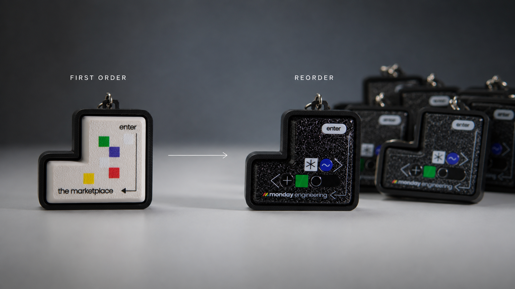
The first version used a clean white keycap. The monday.com branding appeared on the front, while a QR code was placed on the back, allowing the two sides to perform different jobs: the front created recognition, and the reverse provided a route from the physical product to a digital destination.
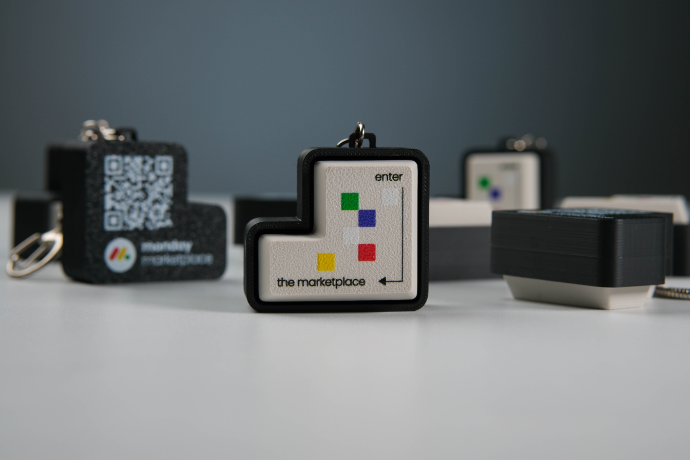
The important decision wasn't simply where to print the logo. The product had to work as one small system, where shape, colour, tactile interaction, and QR placement all needed to support the same event experience without making the object feel overcrowded.
The Reorder Changed the Look, Not the Logic
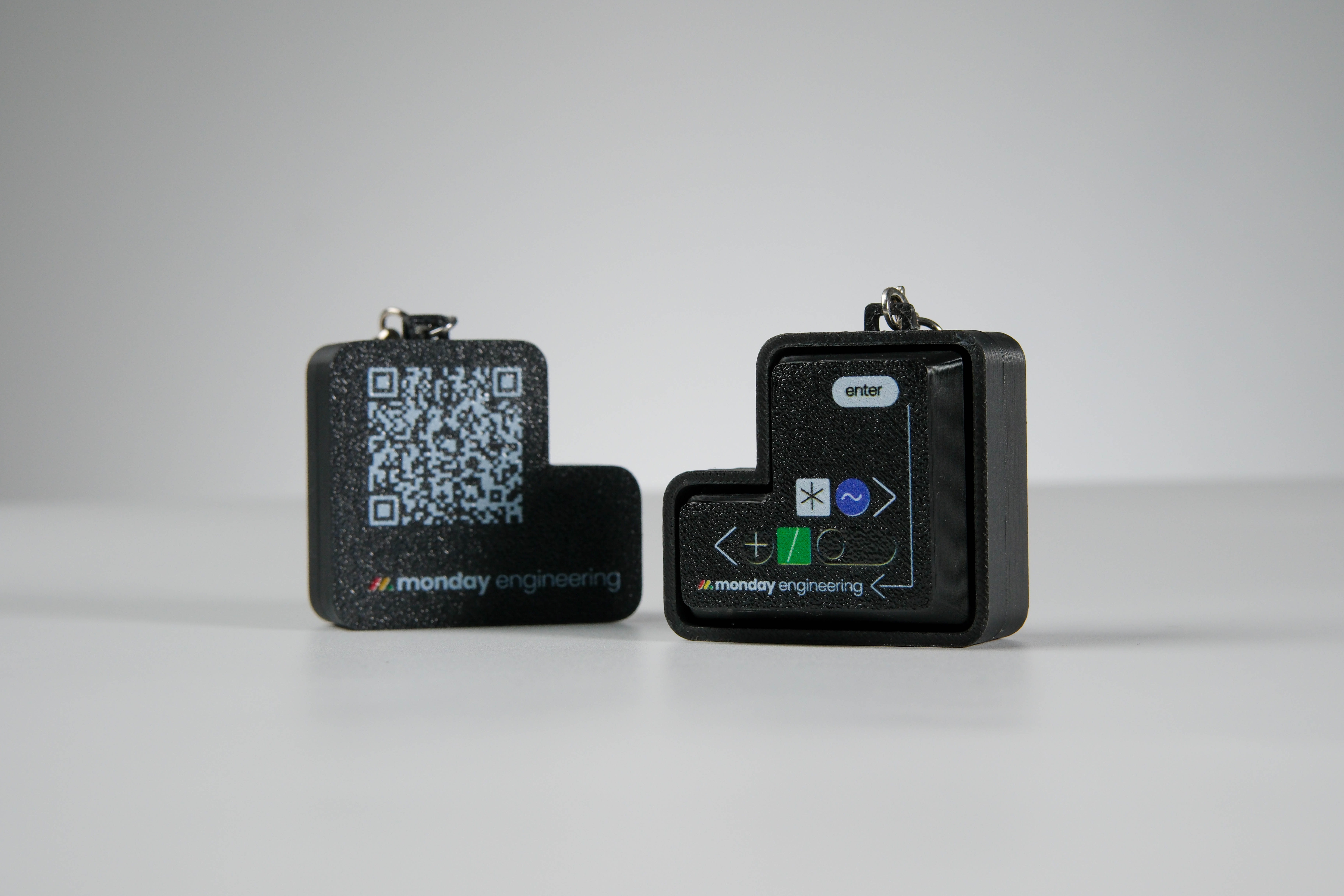
When monday.com returned for another order, the core product remained intact: the retro Enter key shape stayed, the clicky interaction stayed, and the front logo and reverse QR integration stayed. The main change was the keycap colour, moving from white to black.
It may seem like a minor adjustment, but it demonstrates something useful about merchandise design: a strong concept should be able to evolve without being rebuilt from the beginning.
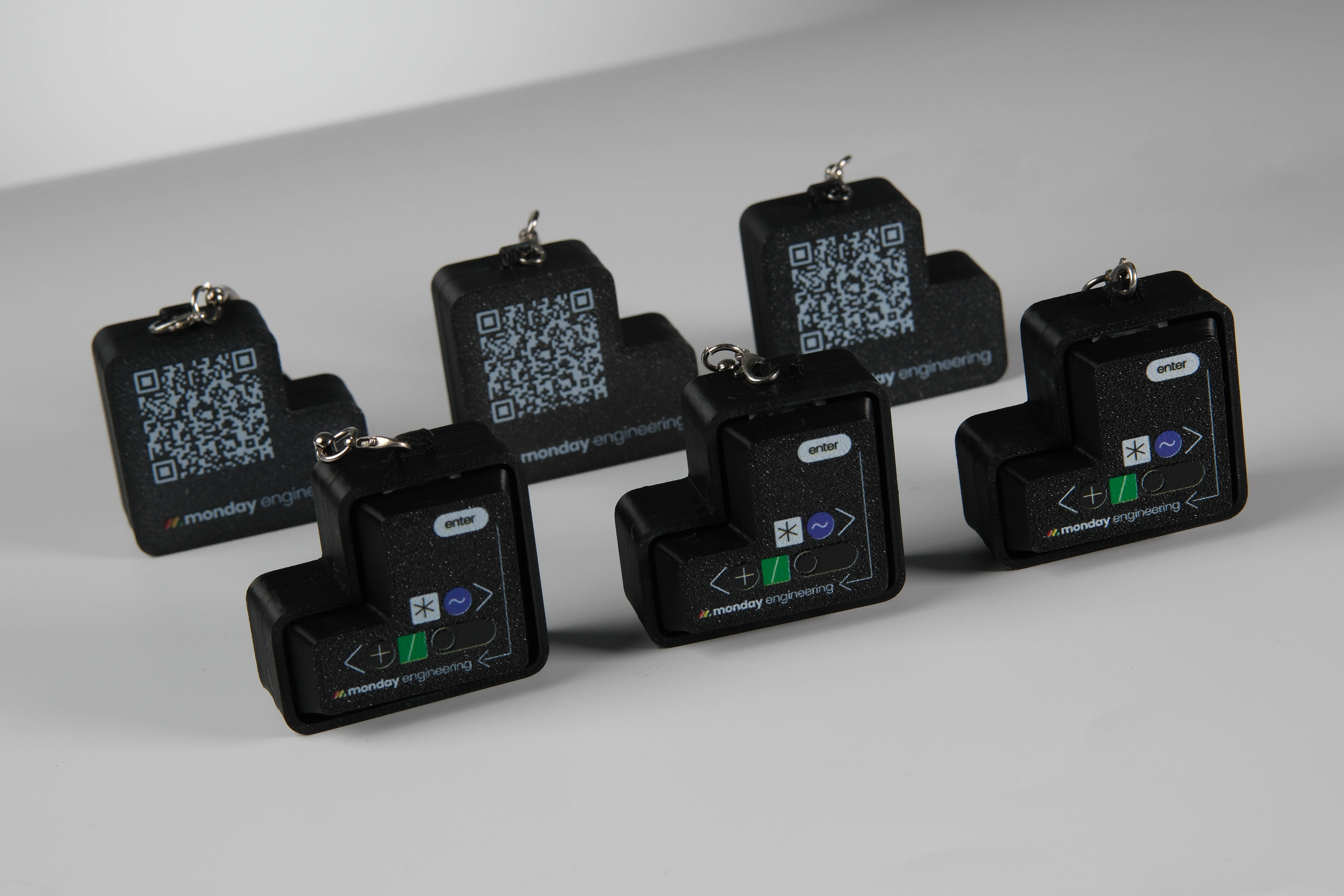
Keeping the same physical format created continuity between the two orders, while changing the colour gave the later batch its own identity. This is especially practical for brands that run multiple events, campaigns, or regional programs, since the product can remain recognizable while selected details change to suit a new context.
The result is not merely a repeated item. It is the beginning of a repeatable merchandise format.
What a Reorder Can and Cannot Tell Us
It's tempting to treat a reorder as proof that recipients loved the product, but that would go further than the available evidence allows. Without attendee feedback, QR analytics, distribution data, or post-event research, a supplier cannot know exactly how every piece was received or used. A reorder alone cannot establish audience sentiment, long-term retention, or return on investment.
What it can indicate is more specific:
- The finished product met the brand team's standard well enough to be considered again.
- The format was practical enough to produce and distribute more than once.
- The design system could support variation without losing recognition.
- The overall project experience gave the buyer enough confidence to continue with the concept.
This distinction makes the story more credible, not less. Good customer stories separate what was directly observed from what is inferred. In this case, the strongest evidence is straightforward: monday.com chose the same customized format again and changed only part of its visual treatment.
Why This Format Was Easy to Build On
Several design choices made the product suitable for repetition.
A Familiar Shape Reduced the Need for Explanation
The retro Enter key gave the fidget an identity before anyone pressed it. It connected naturally with monday.com's digital audience and made the object feel more considered than a generic keychain with branding added afterwards.
The Interaction Was Built Into the Product
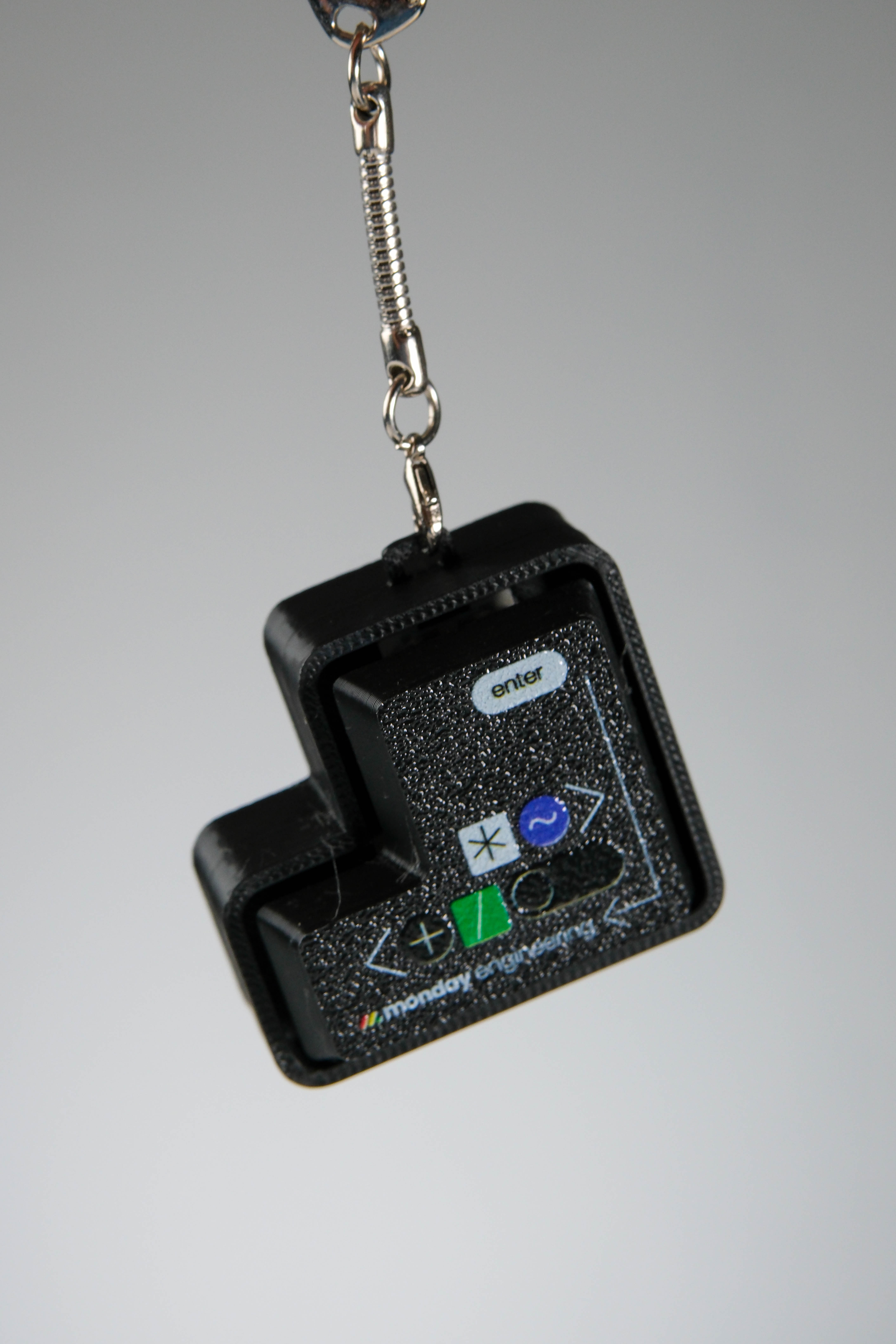
The click gave recipients an immediate reason to handle the item. No setup or instruction was required to understand the basic interaction. The branded surface wasn't merely displayed; it became part of something the recipient could physically press.
Recent PPAI consumer research found that design plays a role in nearly 90% of respondents' decisions to keep a promotional product, while 44% preferred subtle branding over large, dominant logos. The finding supports a useful principle: recognition matters, but the product still needs to feel desirable as an object in its own right.
The QR Code Added a Digital Layer Without Dominating the Front
Placing the QR code on the reverse protected the cleaner branded face while still creating the option for a digital next step. Depending on the campaign, that destination could be an event page, product launch, community sign-up, or other relevant content.
Three Lessons for Event Merchandise Teams
1.Design for the Second Order From the Beginning
The first design should not be so specific that it can only work once. A stable product format can leave room for changes in colour, campaign graphics, QR destinations, or packaging while preserving its core identity.
This approach also makes internal review easier: teams aren't approving an entirely unfamiliar object each time, they're adapting an established system.
2. Decide What Should Stay and What Can Change
Not every detail needs to remain fixed. In the monday.com project, the recognizable Enter key shape and branding structure provided continuity, while the colourway created variation.
Before placing a reorder, separate the design into two groups:
- Core elements: form factor, key interaction, logo hierarchy, and essential construction.
- Flexible elements: colour, supporting graphics, QR destination, packaging, and campaign-specific messaging.
This prevents a new version from becoming either too similar to feel fresh or so different that it loses the value of the original idea.
3. Measure More Than the Reorder
A reorder is a useful commercial signal, but the next campaign should produce better evidence. Brands can track QR scans, redemption or sign-up actions, the number of items distributed, recipient feedback, and requests from teams that want to use the product again.
Even a short post-event review can help identify whether the reorder is driven by audience response, visual fit, ease of distribution, internal stakeholder preference, or a combination of factors. That information turns a repeat purchase into a learning system.
The Second Order Is Where an Idea Becomes a System
The most interesting part of the monday.com project wasn't simply that the product was ordered twice. It was that the second order preserved the logic of the first: the same recognizable shape, tactile action, and physical-to-digital structure could support another colourway without losing what made the product distinct. That's a useful model for event merchandise: create a strong core, learn from the first run, and evolve the parts that should change.
Good merchandise doesn't need to reinvent itself for every event. Sometimes, the better sign is that the original idea is strong enough to return in a new form.
Create Event Merchandise That Can Evolve
GoblinTechKeys develops custom clicky fidgets for events, community programs, and brand campaigns, with customization across keycap shape, colour, graphics, QR integration, and packaging.
If you're exploring an event product that can begin with one campaign and grow into future variations, we can help translate the idea into a clear visual concept before production.

Mission statement isn't a static asset you design once and forget. It is a live promise. In a fast-paced market where users have endless alternatives at their fingertips, authenticity isn't a design aesthetic—it’s the ultimate competitive advantage.
Mission statement isn't a static asset you design once and forget. It is a live promise. In a fast-paced market where users have endless alternatives at their fingertips, authenticity isn't a design aesthetic—it’s the ultimate competitive advantage.
Mission statement isn't a static asset you design once and forget. It is a live promise. In a fast-paced market where users have endless alternatives at their fingertips, authenticity isn't a design aesthetic—it’s the ultimate competitive advantage.
Heading 1
Heading 2
Heading 3
Heading 4
Heading 5
Heading 6
Lorem ipsum dolor sit amet, consectetur adipiscing elit, sed do eiusmod tempor incididunt ut labore et dolore magna aliqua. Ut enim ad minim veniam, quis nostrud exercitation ullamco laboris nisi ut aliquip ex ea commodo consequat. Duis aute irure dolor in reprehenderit in voluptate velit esse cillum dolore eu fugiat nulla pariatur.
Block quote
Ordered list
- Item 1
- Item 2
- Item 3
Unordered list
- Item A
- Item B
- Item C
Bold text
Emphasis
Superscript
Subscript
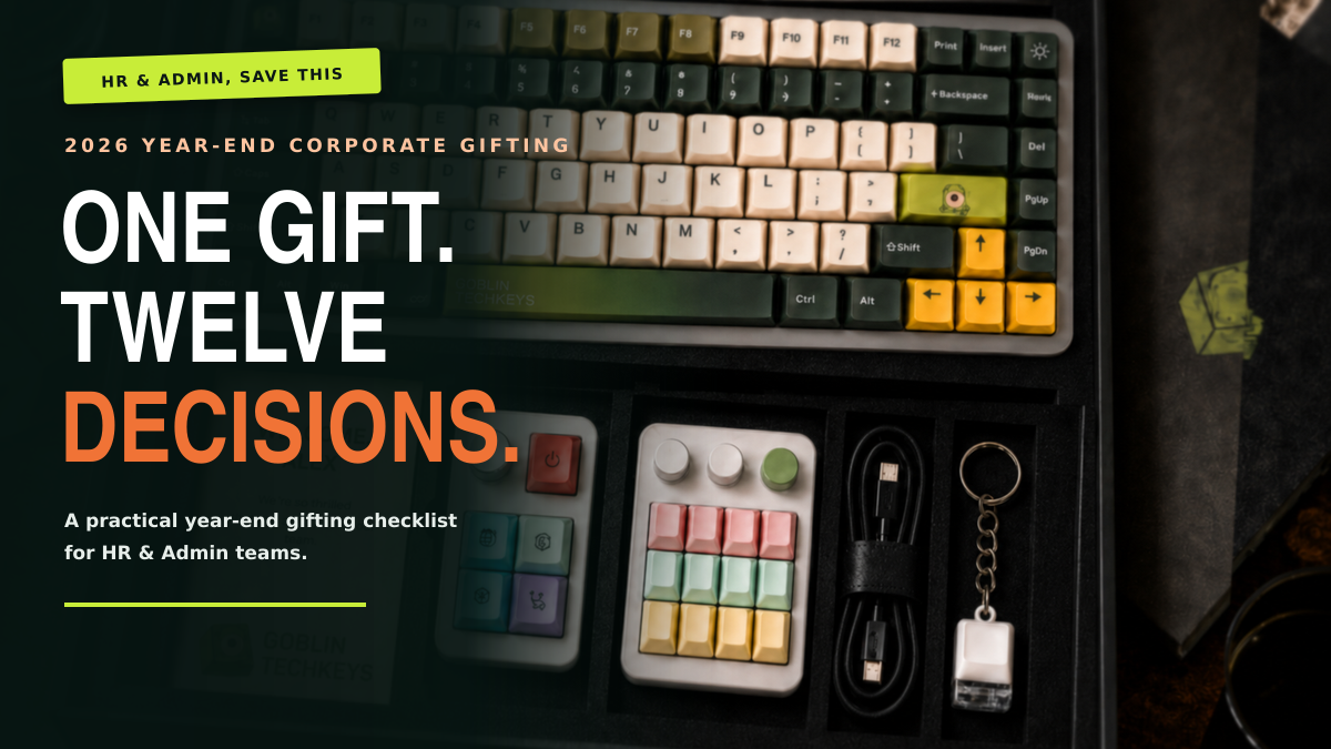
One Gift, Twelve Decisions: The 2026 Year End Corporate Gifting Checklist